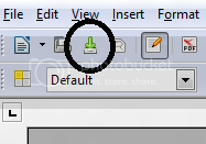
Why is there a weird save icon?

New save button

The save icon is non-standard. As a result, it takes users a long time to find it. There is an established icon for “Save” and it has the following characteristics:

  • It’s blue
  • It shows a floppy disc

The new icon doesn’t fit, because it looks like those “Download now” or “Update available” icons. The ONLY way I (a power user) knew that it was the save icon, was by its position in the toolbar, and by viewing the tooltip.

While it is true that newer generations may not know what a floppy disk is, they certainly recognize the icon, which is the same in virtually every other program.

If LibreOffice would not change the icon back, I would suggest that the green arrow be made blue, and the ambiguous white box be made to look more like a gray hard drive. This way, the icon would be less similar to “download now” buttons, and also the blue color would subtly remind users of the blue floppy disc they are so used to seeing.

The icon has been reverted for 4.0 and later. See http://user-prompt.com/about-antiquated-metaphors-in-icons/

See this discussion

http://nabble.documentfoundation.org/The-Floppy-icon-and-meritocracy-tt3725399.html#a3726059

for an explanation.

You are free to help yourself from the linked theme.

In Menu/Tools/Options/LibreOffice/View, you can select other sets of icons.

I always change the icon set to Galaxy (witch also has a floppy disk icon to save).

By the way the “download icon” is actually arrow to point to save to hard disk. :slight_smile:

In theory, a user can select other sets of icons. In reality… I have just tried 3 different distro’s, and all ship with only Human installed. I had to hunt down that on Debian based systems, the packages that need to be installed start with libreoffice-style, such as libreoffice-style-galaxy . I’m not sure how it ships on Fedora or Windows. This situation sadly sets changing icon styles as a fairly high bar for new users- search terms, pkg installs, obscure menu options.