Hi,
I’m working on a presentation where I’m presenting statistical numbers. I want to create charts, or graphs, where I show both the data number AND a percentage relative to a “max number”.
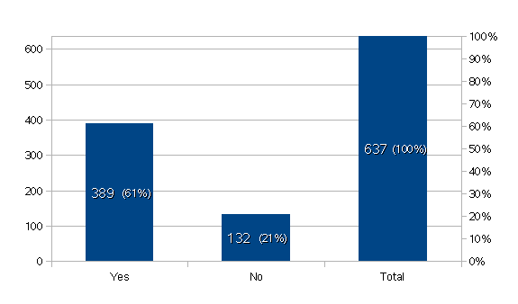
The datas are based on a user survey I completed, where the “max number” would be the number of people that completed the survey (637). I can’t seem to figure out how to fix this.
Here’s an example:
Now, the percentage here is always 100%, so it’s obviously not relative to anything.
If I change the data table and separate it to columns, adding a “total” column and setting that one to the primary Y axis and the other two (yes/no) to the secondary Y axis, I get this:
While what I really want, is this:
Anyone know how to do this?
I’m sorry if I’m a bit hard to understand. Not quite sure how to present the question :-/