Multiple graphs in one chart

I have two sets of Data:

Total balances of account 1 with their respective dates and total balances of account 2 with their respective dates.
Of course the dates of the data for account 1 and account 2 can be very different.

E.g.

Dates of Account 1: 01.01.01; 02.01.01; 30.01.01

Balances of Account 1: 0$; 2$; 3$

Dates of Account 2: 01.01.01; 05.01.01; 25.01.01

Balances of Account 2: 2$; 5$; 3$

Now I want to create a Chart where I can see the balance of each account at each time (connected with normal lines). (So e.g. blue line is for Account 1 and red line is for Account 2, since both balances are in a similar range, these two lines should be next to each other horizontally)

What is a good and particularly flexible approach? (Later on, I might add more data to each dataset)

Edit: Thanks for the answer so far. The problem is that Account 1 and Account 2 can have different dates.

So Account 1 has dates: 1. Jan, 2. Jan, 30. Jan

And Account 2: 1. Jan 5. Jan, 25. Jan

I don’t want to fill in the missing dates and I have many many X values, so it’s not feasible to use markers.

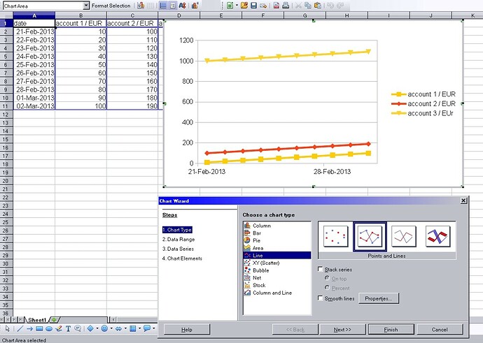
Why not us the line graph chart, using the date as the x-axis you can draw to two line graphs. You can use markers to indicate actual dates.

Sorry I cannot upload a sample, not enough Karma :slight_smile:

I try to give you some karma. Your proposal is perfectly right!!!
If you cannot attach due to insufficient karma, try to attach a screenshot into your answer. However i don’t know how much karma is needed for that

@ROSt53, I believe one needs 3 karma points to upload a file.

@qubit1 - How to give 3 karma points? I really don’t understand the karma system yet. Clicking on the UP or DOWN arrow give how many karma points? How are given when the question is right?

@ROSt53 – I think that most of your questions can be answered by the faq. Ping me back if you have more q’s :slight_smile:

you can easily have even more than 2 accounts. I created an example. Screenshot should explain all what is needed.

Instead of using a Line-chart use a x-y-chart. Set the spreadsheet up as ROSt52 suggested but don’t care about filling the dates up. You can have 2 1.Jan
`

Date  Acc1  Acc2
1.Jan $1.-
5.Jan $3.-
1.Jan $3.-
3.Jan $4.-

With x-y-chart it does’nt matter where the dates (x-values) are. I hope you get the idea.

BTW x-values are the dates, y1…yn are the account values.

@BenKen – Does @horst’s Answer work for you?

While the answer here may be effective, a Line chart should be used unless there is an intrinsic relationship between the x,y value pairs e.g., a pair of related measurements for a given date. An XY (Scatter) chart uses a separate (3rd) column to represent the category. Refer the answer here.