Adjust huge spacing around specific fonts

Hi there!

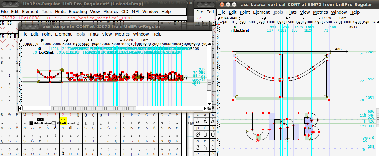
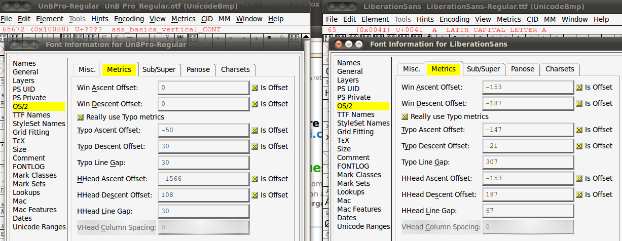
I found a font based on Liberation Sans named UnB Pro, and I really liked the look of it, especially the light and black versions. I downloaded it from here: Marca UnB and I attempted to start using it in LibreOffice 3.6.

However, there is a huge amount of line space above the font. If I switch to another font like Liberation or UnB Office (which is just a renamed Liberation) then normal spacing above the characters is restored.

I then tested the same UnB Pro fonts in Scribus (http://www.scribus.net), and suddenly the spacing issue vanished! I can’t seem to figure out why Scribus “corrects” the font “spacing” while L.O. does not.

Is there some way to “force” L.O. to display the fonts in the same way? I have already set the style of the font to superscript with no zoom and negative line spacing, but that did not work.

I would appreciate any help in this regard. Thanks!

I use LibreOffice 3.6.2.2 (Build ID: 360m1(Build:2)) on Ubuntu Linux 12.10.

The font in question is basically and old copy of Liberation Sans scaled to ~50%. The font contains some branding glyphs (for the Universidade de Brasilia) in a non-Unicode range 65668-65673 that are of huge proportion (screenshot). In order to allow the taller logos to fit I imagine the HHead Ascent Offset (line height) magnitude was substantially increased from -153 for Liberation Sans to -1566 (screenshot) in the font in question. LO is treating the font as it should from what I can tell.

Dear oweng

Thank you so much for going to the trouble. I know very little about how fonts work, so your information is appreciated.

Unfortunately, I am still unable to use UnB Pro in LibreOffice. Is there any way to force or fix this line spacing, or even to implement some sort of workaround?

Yes, this should not be too difficult. You will need to edit the font with an application like FontForge (which my screenshots show), delete the six oversized glyphs in the range I mention and set the HHead Ascent Offset to something more reasonable i.e., start with -153 and work your way toward something like -75 or so. You then need to export the result to a new OpenType (OFF) font file. You will need to do this for each of the font files - I only examined the Regular weight.

Thanks, oweng. I unfortunately know nothing about doing those things, and I have never used or installed FontForge. I will see if I can get someone to help me with that.