Simple pivot table

I have a one column spreadsheet with 3 different entries across 1200 records, basically 3 different responses to a questionaire answered by 1200 people. I need to make pivot tables showing frequency distribution by #responses for each catergory and also a table showing percentage of responses and then a pie chart. I only have instructions for excel, and can’t even get the first step to work in Calc. I can’t get the #s to show up, only the response categories.

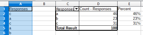
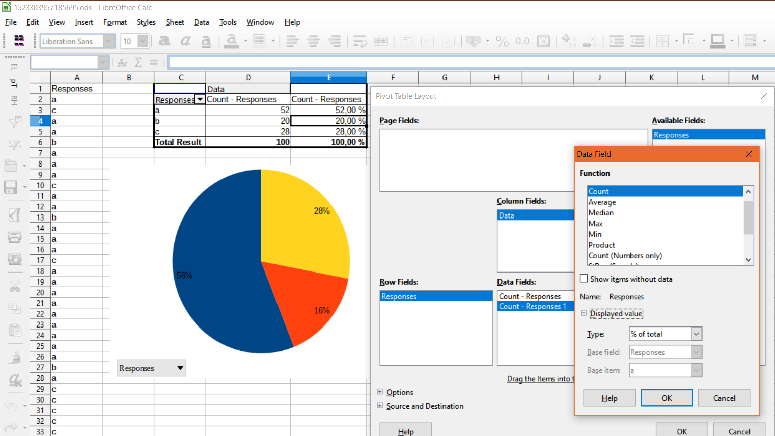
Gonna try to attach a screenshot of my actual table and chart. Everything is hunky dory till I try to label the pie, but I still cant get that to happen. My table is a little different so maybe that’s why.

Not sure how to make that image appear inline but hopefully the link works for you.

(Edit: activated screenshot)

I only have instructions for excel. Why so limited? There are plenty of pivot table examples on this site as well as other places on the web. See the first bullet point in guidelines for asking.

Sorry I’ll try to be more specific next time. I did search but couldn’t find any single field examples before I posted.

  1. Add a title for the column in the first row, for example, “Responses”.
  2. With that cell active, go to Data → Pivot Table → Create, OK.
  3. Drag “Responses” to both Row Fields and Data Fields.
  4. Double-click on “Sum - Responses” and change the function to Count.

The pie chart can automatically show percentages, but I’ve also added formulas for percentages in column E. The formula in E2 is =D2/D$5, filled down to E4 by dragging.

pivot table

To create the chart, select C2 through D4 and go to Insert → Chart.

Sample file.ods

Perfect, thank you. I had tried everything except dragging the reponses to BOTH Row and Data fields. That never occurred to me because I don’t know what I’m doing yet. Hopefully it will become obvious once I go on to other operations.

This is for a free online class in statistics that I’m taking. I use Calc because I use Linux. I’m also using R so I know how to do the problems 2 ways.

Taken the Jim sample it’s possible to get the percent inside the pivot table.

Sample file

How did you get the percent labels? I’ve got the chart now but not the labels

sorry maybe that’s explained below. I’ll play with it a bit. I’m very new at this.

Right-click on the pivot table and do as is on the graphic.

Hmm. That’s not working for me. I can do as shown but the percents still dont show up anywhere except the table