While should looks like this:

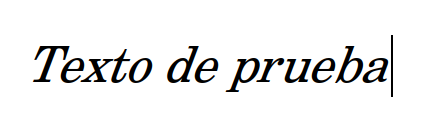
That looks like the fake italics which are simply slanted regular.
Are you sure the italics font is installed?
Where was this font downloaded?
OK, I installed the fonts and found the problem.
LibreOffice is not connecting the Regular font to the Italics, Bold, and Bold Italics fonts.
So LibreOffice is displaying the faked italics and faked bold instead of the real fonts.
The font is the problem.
This is caused by the font metadata defining the regular font subfamily as Roma not Regular.
I edited the regular font metadata to change the Font Subfamily to Regular.
When I installed this font instead, LibreOffice then displayed the proper Italics, etc.
There is another free open source version of Century Schoolbook - TeX Gyre Schola.
See: TeX Gyre Schola - The TeX Gyre (TG) Collection of Fonts
It actually a much better version with many OpenType features.
OpenType Features
aalt Access All Alternates
c2sc Small Capitals From Capitals
cpsp Capital Spacing
dlig Discretionary Ligatures
frac Fractions
kern Kerning
liga Standard Ligatures
lnum Lining Figures
locl Localized Forms
onum Oldstyle Figures
pnum Proportional Figures
salt Stylistic Alternates
size Optical size
smcp Small Capitals
ss01 Stylistic Set 1
ss02 Stylistic Set 2
ss03 Stylistic Set 3
ss04 Stylistic Set 4
tnum Tabular Figures
zero Slashed Zero
I have tested this font in LibreOffice and it is working fine.
If this has answered your question, please check the checkmark at left.
.