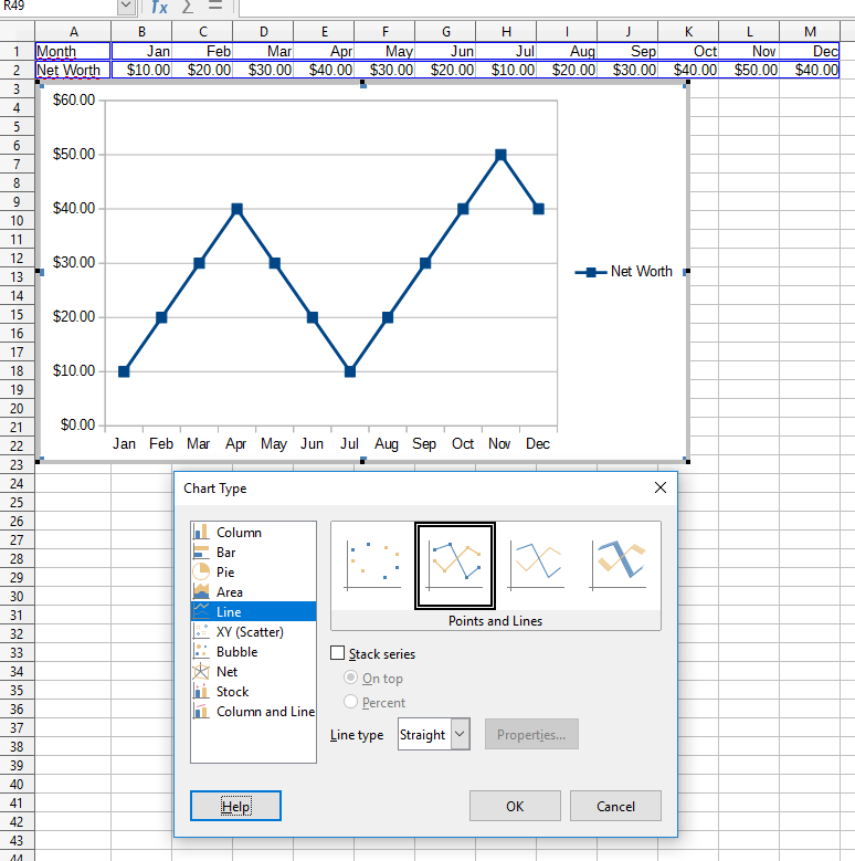
I’m trying to create a simple XY scatter that tracks monthly net worth over the course of one year (Y-axis is value, x-axis is each month).
The data source is simple: two rows. Row one is the list of months and row two contains the numeric values ($10, $20, etc.). However, regardless of what I do with the X-axis format, it refuses to stop duplicating month labels.
How can I get the X axis to only have 12 values, labeled by month? Forcing X-axis to start in January and end in December, with a major interval of 1 still gives me duplicated months.
Interestingly, the chart works if it displays the months as simple numbers (1 through 12), but not when it is pulling info from a DATE formatted cell.
Please see the following album for the sample chart: Imgur: The magic of the Internet
Thanks in advance!