
I am writing the title of a book in 18 point Calibri. The title is “Breakthrough.” and the top of the B is cut off. I tried changing font, but the effect persists. The top is cut off so that the top of the B is level with the tops of the lower case letters.
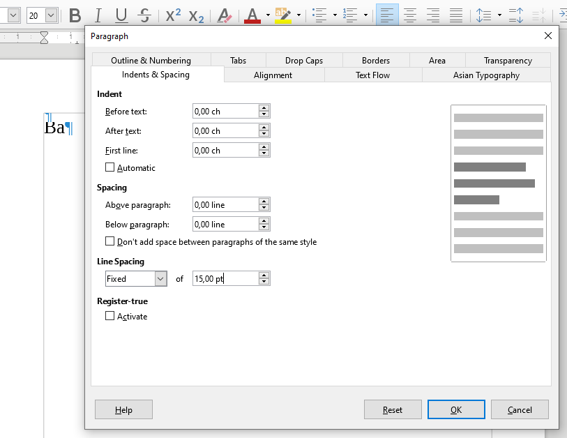
Some fonts are also poorly designed, and their ascenders and descenders weren’t properly included within their total height, so they get visually cut off by most programs. Oftentimes it is just a visual thing though, and exporting to a PDF or printing the doc will reveal the “hidden” font glyph segments. Each program handles rendering differently. If a very small line height is chosen, will the letters overlap into a mess or “chop” the previous line off. I’m not sure how LO handles this.