Hello @JestPhulin
It is possible to use a combination of functions for such task, but you also can create a PivotTable to achieve the goal mentioned. I have created a sample spreadsheet and will describe the process.
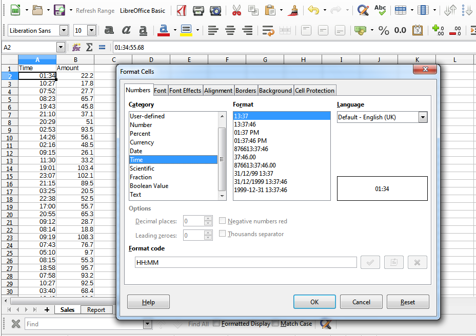
Step 1. The most important. Prepare source data. As dates/time in Calc are represented as numbers (dates) and fractions of the day (time), you need to correctly prepare data for processing. If in the source data time is represented as text string, you can use TIMEVALUE function to convert it to the internal numeric representation of the time value. Conversion depends on locale. So in the end all selling times should be represented as fractions between 0 and 1. Then you need to format these cells as time, for example HH:MM for comfortable representation of values. This is a must for correct data processing/interval grouping. Be aware that all Date functions will treat these values as date of 1899-12-30 (mostly, depends on Calc settings)
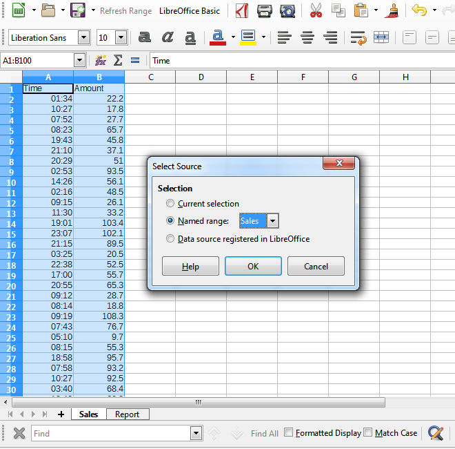
Step 2. Click on any cell inside your source data and go to menu Data -> Pivot table -> Create... The whole source range will be selected. In dialog you can chose Current selection and click Ok (I use previously defined Named Range as source in my sample)
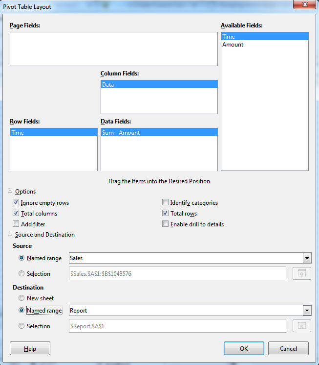
Step 3. Pivot Table Layout dialog will appear. Drag Time from Available Fields to Row Fields and Amount to Data Fields Yous can double-click on Sum-Amount entry and adjust function applied. You can also select destination place for created table and other details. Click Ok to create Pivot Table.
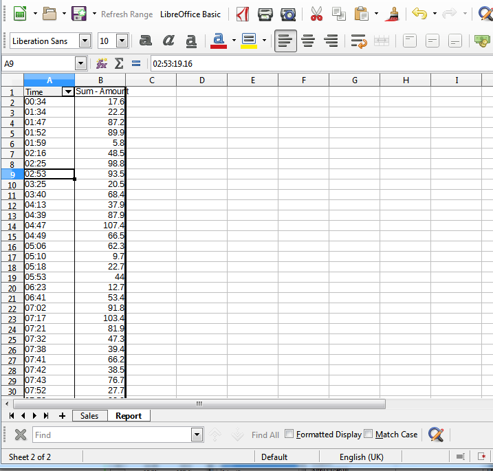
Step 4. You will get a table with almost every sale on its own row, only those with exactly the same source time value will be combined already.
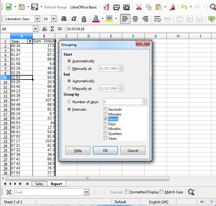
Step 5. So now you need to group times by intervals. In created Pivot Table Click on any cell representing time and go to menu item Data -> Group and Outline -> Group... In dialog select Group by -> Intervals -> Hours
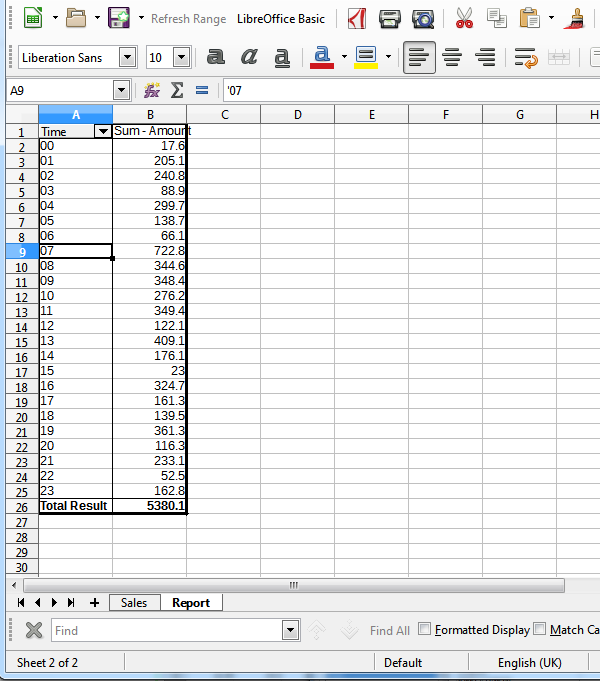
Step 6. Enjoy the result.
The created table is interactive. When source data changes, you just right-click on it, select Refresh and contents will be recalculated based on new data. You can also link chart to PivotTable data or query data with GETPIVOTDATA function.