Impress not displaying fonts correctly

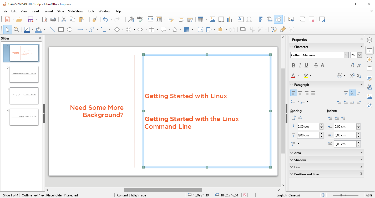
I’m running LO Version: 6.0.7.3 with Build ID: 1:6.0.7-0ubuntu0.18.04.2. When working with slides using fonts from the Gotham family, text renders incorrectly both in the edit mode, and when exported to jpg or png files.

UPDATE: Based on Mike Kaganski’s
comment below, it seems that the
problem isn’t that LO is displaying
the wrong font, but that it’s
displaying the correct font using bold

  • and that there’s no obvious way to remove the bold.

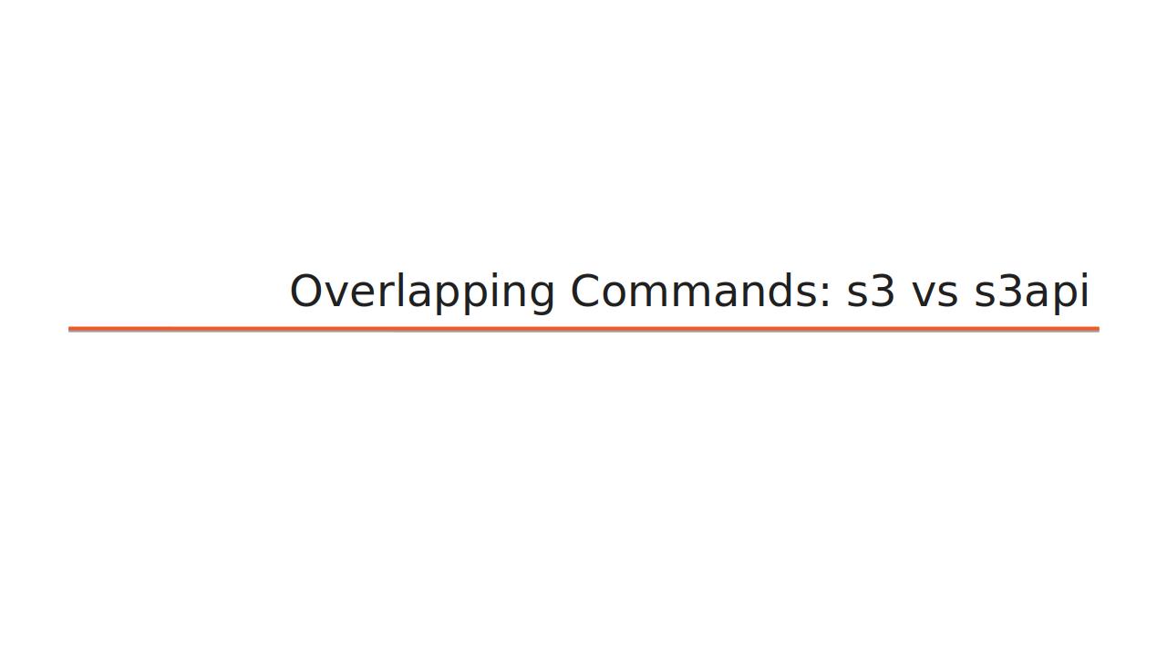
Here’s how the font is supposed to look (this was exported around four months ago - I’m not sure which release of LibreOffice I was using at the time):

And here’s what I’m getting now (exporting from the same file/font):

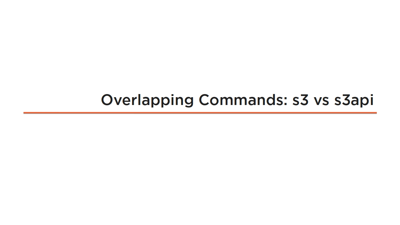
A close examination (especially of the number “3”) shows that this isn’t just a bold version of the original: it’s an entirely different font. I’ve reproduced the problem using LibreOffice on Fedora 29 and installing the older LO 6.0.0.6 package on Ubuntu 18.04. Any ideas what’s going on?

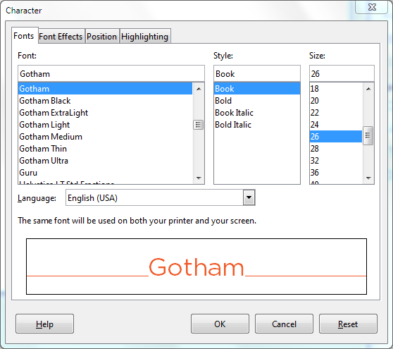
UPDATE 2.0: Here’s a sample of what Gotham is supposed to look like in this context:

Any ideas what’s going on?

Well - nothing except now you see how Gotham fonts actually look. And your first export was on a system with the font likely absent (or that’s where some problem existed actually).

So, it’s incorrect that “Impress not displaying fonts correctly”.

EDIT:

here is what I see opening the provided sample (note that I assigned the bold to the first words of second paragraph of selected text box, for comparison):

Note that the bold actually differs; so it’s not that LO assigns the bold option to the text - it’s just the regular font itself has that “bold”-ish appearance. (Or possibly @RGB-es could have more to say here.)

That was a smart observation. In fact, it is possible that Gotham wasn’t properly installed on the earlier version. The problem is that the people who provided me with the Gotham font (the Pluralsight production team - this is part of a Pluralsight video course) are telling me that the new version isn’t even close to what Gotham is supposed to look like, and they were happy with the previous version. So, one way or the other, I’m not getting the real Gotham in Impress.

Actually, after taking another look at the way Gotham fonts are supposed to look, I think you’re correct that the current version is actually Gotham (that “3” is a very Gotham 3). The problem I’ve been having (and, now that I think back, the complaint of the production team) is that, for some reason, LO is displaying it in bold even though the weight is not set as bold. Any ideas on why that might be happening and how to fix it?

Using provided JPGs instead of actual document? No.

Unfortunately that’s not ideal. Over the process of working on a single project, I export hundreds of slides. I really need to find a way to do it myself.

Well - yes, if you find the solution yourself, you’ll gain great experience.

Still, I don’t see how providing a sample so that others could possibly find a problem and describe contradicts with being able to then handle the problem yourself (now knowing the root problem).

But I don’t yet know the root problem - you’ve helped me properly define only the symptom. At this point, because LO is invisibly applying the bold attribute to one of my fonts, I am effectively unable to use LO for a mission-critical task. I have no idea whether anyone else has this problem (so I can hardly expect all the LO developers to drop everything they’re doing to help me out), but this is beginning to look like a bug.

Well - I fail to see then why had you decided to ask the question here in the first place. My impression (as a LO developer and Q&A volunteer) is that people come here looking for help, including finding root cases (which implies providing necessary info to those who might want to help). You effectively say “I won’t give you sample (so you could help me to find the root) because I don’t know the root”… strange.

Oh sorry. I didn’t realize you were asking for a sample of the ODP file. I’ve added it as an “answer”

Please always edit question to add something omitted/clarifying. Answers are only for what answers the original question.

Good point. My problem is that I am lousy at recognizing fonts: I can tell the differences between serif and san serif and mono spacing, but that’s about it. I’ve added an example (from a different Pluralsight course) of what Gotham is supposed to look like in context.

I don’t have the Gotham font in my system, but looking at this page it seems that the font offers a lot of weights, and maybe that’s the problem: LibO gets confused when a font offers more than the classical R/I/B/BI variants. One (awful) workaround is to delete all variants of the font you’ll not use, leaving only the “traditional” ones on your system.

For the record: I also had no Gotham fonts prior to that - just seeing the font name, I googled it, and installed a single one from here.

That “awful” workaround wouldn’t be such a terrible thing for me: I only use three of the variants anyway (book, medium, and light). So I removed the other three or four variants I had installed and ran fc-cache -f -v to update the system. Font Manager now lists only those three variants. However, after restarting LO I’m still getting the wrong font.

One update: a friend running Version: 6.1.4.2 - Build ID: 6.1.4.2-1.fc29 isn’t having trouble with the Gotham fonts - even though he’s using them the same way I am. So it’s obviously not a system-wide problem.

ODP sample:
sample.odp

I think the way this font family is constructed is confusing LibreOffice and you.
There is no defined Regular font which is normally what a Style Group is based on.
Regular, Italic, Bold, Bold Italic (R/I/B/BI).

This font family has a Gotham style group which is comprised of the following 4 fonts:
Book, Book Italic, Bold, and Bold Italic.

So when I select Gotham from the font list what I am actually getting is Gotham Book.
This appears to be the font you want based on the images I see here.
I can see this is the font style that selected in the Character dialog.

image description

On the first slide the font selected is Gotham Medium which does not appear to be the font you want.
Too heavy compared to your example.

Usually the fonts used to print are the same as those used for Export to PDF.
So you can check to see if the correct font file is being used by examining the PDF.
This is an example of Gotham Book. Looks good onscreen. Correct font in the PDF.

.

I know that LO on Linux does get fonts confused in different ways than on Windows.
One way to minimize font substitution confusion errors is to only install the fonts you are actually using.
So if you are only using Gotham Book, only install that font.
Remove the other Gotham fonts.
Un-install Gotham Medium if not using it.

In my font family tests I have seen some situations where LO is confused and all on its own applies fake bold to a font.
Hopefully that is not what is happening here.

.

Well that worked! I removed everything except Gotham Medium and the font exported was correct. The problem is that I really do need two other fonts: Book and Light. But at least I think we can say we understand what’s going wrong.
Thanks to everyone (although don’t be shy about letting me know if anyone comes up with a real solution).

It may work properly in LO on Linux if the fonts are modified so all weights are separate style groups.

Be happy to work with you to see if we can get it working properly on LO Linux.

If this were a real forum we could actually communicate privately via PM.

Only way I see to do that in this horrible excuse for a support forum is if you post an email address.