How can I show monthly and yearly data in the same graph?

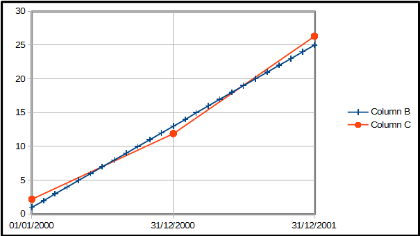
I have two data sets over the same span of time. One set has monthly data, and the other has yearly data. How can I show them on the same line chart?

I tried putting the yearly data with the monthly data, like this CSV:

Month, Monthly data, Yearly data
Jan 2000,1,1.2
Feb 2000,2,
Mar 2000,3,
...
Dec 2000,12,
Jan 2001,13,12.5

I couldn’t get the yearly data to show up on my line graph due to the missing data.

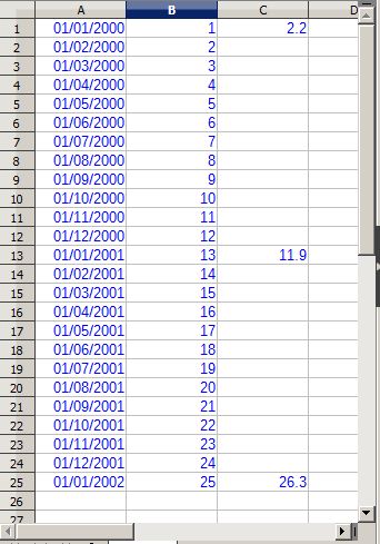
It’s actually already a pain to get the data in the format above. I would rather pull data from one sheet which is monthly and a second sheet that looks like this:

Year, Yearly data
1/1/2000,1.2
1/1/2001,12.5
1/1/2002,25.3

Can I pull data from two different sheets like this, and have LibreOffice show them both on a line graph with the same X axis?

Please attach a sample file with both graphs to know what you want?

I am not sure how to solve the “missing data” problem with the csv import, but if you can add the yearly data by hand to the spreadsheet, for example, you can have a chart like this (it is actually an x-y scatter chart, rather than a line chart) :

monthly-yearly-data.png

I have exaggerated the difference between monthly and yearly values so they are more easily distinguished on the graph. Under Plot Options for the yearly data, be sure to check “Continue Line” for Plot Missing Values.

Screenshot - 10_06_2019 , 22_14_05.jpg

Does this work for you?

And note that X-Y chart allows adding arbitrary number of data series, each with own ranges - so you can put own ranges for each series’ X, Y, label, and title - including from a different sheet. Start creating the chart for monthly values, and then edit series as needed.