Creating a scatter plot in calc using python

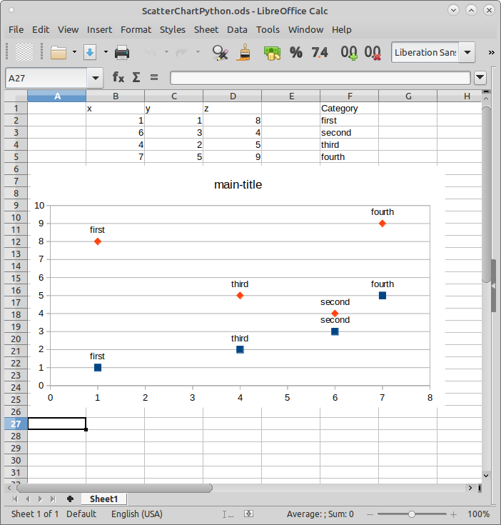
Hi everyone! I am writing a script in Python to create a scatter plot in Calc. For now I can plot the points from the data looking like this:

Is it possible to add point labelling on the chart? I tried to add a column with labels, but that creates a second set of points. My code looks like this for now:

charts = sheet.getCharts()
rect = Rectangle()
rect.Width, rect.Height, rect.X, rect.Y = 22000, 12000, 1000, 9200
range_address = []
range_address.append(CellRangeAddress())

range_address[0].Sheet = sheet.RangeAddress.Sheet
    
range_address[0].StartColumn = 1
range_address[0].EndColumn = 3
range_address[0].StartRow = 0
range_address[0].EndRow = 4

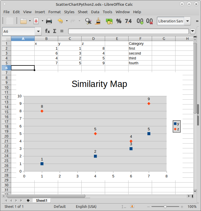
charts.addNewByName("SimilarityMap", rect, tuple(range_address), False, False)
chart = charts.getByName("SimilarityMap").getEmbeddedObject()
chart.createInstance("com.sun.star.chart.XYDiagram")

chart.HasMainTitle = True
chart.HasLegend = True
chart.Title.String = "Similarity Map"
chart.Title.CharHeight = 24
chart.HasSubTitle = False

diagram = chart.getDiagram()
diagram.Lines = False

Hello,

First, have found at lease one related bug → Bug 98543 . I believe there may be more.

Spent some time on this today especially trying to get a handle on XY scatter charts. Not much problem if just trying to display the actual value but when it came to adding an actual label, well it wasn’t good. Toward the end I decided to create one through the chart wizard. After MANY attempts in correcting ranges, this is the result:

You may want to try to duplicate but be prepared on the ranges changing.

In trying to do this with Python did not have much problem with displaying just the Value (not a label per se):

But trying to display labels produces skewed results - displayed data is incorrect.

Believe this is a buggy function currently.

Also of note, in your script the data series you are selecting begins in column B and ends in column D. Not where the actual data is.

FYI, setting the figures is:

from com.sun.star.chart.ChartDataCaption import VALUE
from com.sun.star.chart.ChartDataCaption import TEXT
diagram.DataCaption = VALUE
diagram.DataCaption = TEXT

with VALUE shown in above sample and TEXT being the problem. Also needed second array of cell address when using addNewByName. This was for the separation of data and labels. Found it best for these not to be contiguous.

Dear Ratslinger, thank you for your answer, it helped a lot! I might just confused the code with the ranges - I’ve been fiddling around with this and that.
Yep, the wizard chart creation also proved to be very annoying and not really handy, glad to hear that I’m not the only one in this.

Do you also maybe now by any chance, if it’s possible to color the point by it’s category? For example, trying to simulare some kind of clustering?

@Anastasia wrote:

if it’s possible to color the point by it’s category?

When the data point was examined it was read only. Seems this is applied for series.