
Created a document as a mail template on our office letterhead. Set it up to do a mail merge. Everything goes swimmingly with that part of it, but . . . the merged document screws up the letterhead. It somehow causes the fonts to take up different space, although LibO says they are the exact same size, exact same kerning, exact same position, etc. I tried cutting and pasting from the letterhead master document to replace the letterhead on the merged document, and got the same results.
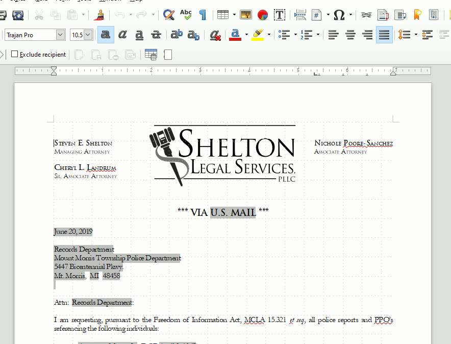
Here’s the original:
And here’s the merged:
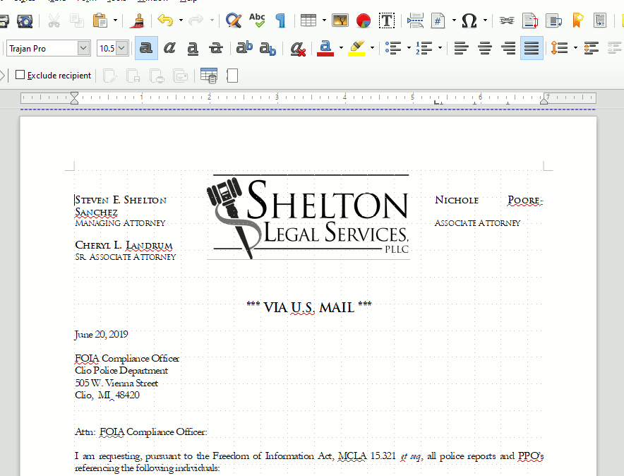
Both screenshots are with the zoom at 100%.
Again: LibO says the fonts are the same size, at the same location, and with the same tabs/margins on both documents, and yet the second name wraps on the second document. The only way to get the name to not do this on the second document is to move the tabs, but then it just looks stupid.
I did discover that if I copy and paste the content from the merged document onto the original, it fixes it: the pasted letterhead text displays properly when cut from the document showing it is incorrect and pasted to the original.
Any idea what could cause this and/or how to fix it? We’d like to keep the mail merge document as a template for future use.