
I’m trying to create a chart where the x-axis is date time values, but the chart always seems to line up all y values for each date with the date only, no separation by the fraction for time.
How can I make it use the full value?
This question lacks plenty of information. You did not specify
- Your OS version
- Your LibreOffice version
- The type of chart you are using [XY (Scatter)?]
- The exact format of your date time values (as per format specification)
- The chart you get and how you want to have it look like (at least for me)
In general: LibreOffice Calc uses the format of the data as specified in cells by default, when creating a chart using the chart wizard. But you can change the format by unticking Source Format in the Format Axis dialog of the X-Axis (double click on X-axis will open the dialog) and defining your own format for the X-axis (Tab: Numbers)
ok - OS Windows 10 & Libre Office Version: 6.2.4
The type of chart - preferably line
The format I did say were datetime values - numeric values such as 43643.265150463 which with a format mask of time: dd/mm/yyyy hh:mm shows up as “27/06/2019 06:21” I have a few data points every hour for a week.
Ideally I’d like the x axis to show the dates & have the points on the lines spread across the space for the day.
Instead I’m getting it truncating the values to the integer date. All Y points align to the midnight time. Instead of a roughly smooth line I have a staircase.
It’s not that the format doesn’t show, it’s that the chart has truncated the date+time values to dates with no time.
I’d use “XY (Scatter)” which allows you to define the format as per my comment.
Hello
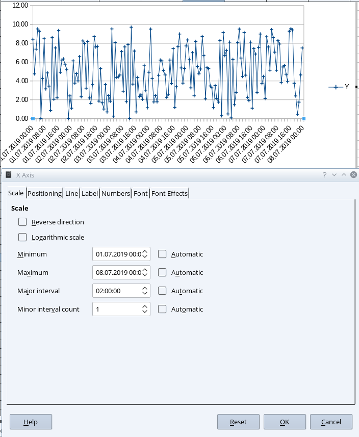
for illustration purposes an XY (Scatter) graph for one week / each hour a random number between 0 and 10 / resolution 02:00 hours
Update Testing OPs data:
I cannot confirm any change in values.
1 Like
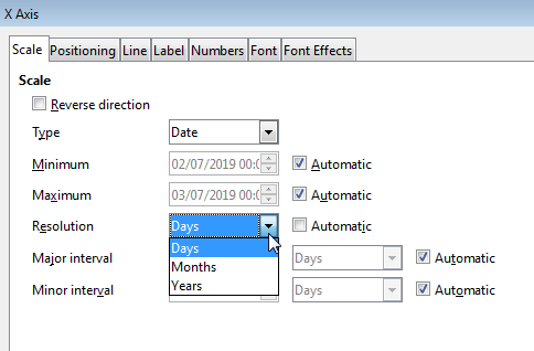
Hi
Unfortunately, if I understand the question correctly, the smallest resolution is the day:
Regards
These are the options for Chart Type “Line”, but check also “XY (scatter)”
It’s not the formatting of the axis, but the error introduced in the values that’s the issue.
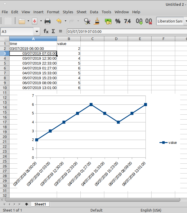
OK - i have a solution and a problem.
The solution is to use XY(Scatter) which is not initially clear because I don’t want a scatter plot, I want a line, it is a continuous function, but the interpretation of ‘line’ category is assuming the X axis is merely labels, not values. Ok.
But there’s some odd behaviour evident in the line option.
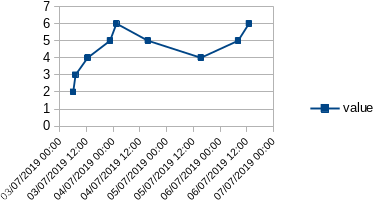
I made a tiny dummy spreadsheet
time	        value
03/07/19 06:00	2
03/07/19 07:03	3
03/07/19 12:30	4
03/07/19 22:33	5
04/07/19 01:27	6
04/07/19 15:33	5
05/07/19 15:23	4
06/07/19 08:09	5
06/07/19 13:01	6
insert- chart, select line type, it shows the gathered values. The first 4 y points all on 03/07 are lumped on 03/07 00:00
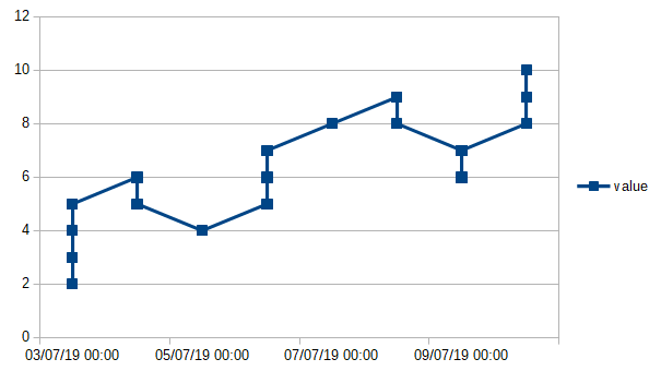
But if I select next & on the Data range page uncheck First Row as Label, it then assigns each point a distinct x axis position. They are not unevenly space like the XY plot, but at least they are unique.
Values shouldn’t be changed by the assignment of a label, this would seem to be a bug.
Please do not post “Answers” if you actually don’t answer a question. And if you feel something is a bug please file here. Now it starts to be a problem which cannot be analyzed without havin an example of your data. Please consider to upload an anonymized version.
My “answer” is a better understanding of how Libre Calc describes the chart types.
I’d more or less ignored the type labelled "XY (Scatter) because I didn’t want a scatter chart, I wanted a line of a continuous function. But “Line” type isn’t quite that.
Your suggestion to use “XY (Scatter)” ultimately resolves my initial issue. Thanks for the help.
I had become distracted by the bizarre behaviour within the line chart type.
Please check the update in my answer. I have added the XY chart for your test data and I cannot confirn what you called are lumped on 03/07 00:00.
Each spreadsheet program seems to use different methods for handling dates and times and their various formats. To avoid having to learn a different method for each program, you could calculate your own fractional Day of Month (DoM) value for your observations, and plot your y-values against the corresponding calculated DoM value.
In LibreOffice, if the date is in column A and the time is in column B, the DoM for row 9 can be calculated from =DAY(A9)+HOUR(B9)/24+MINUTE(B9)/1440
Be sure to use the x-y (scatter) diagram and plot your y-values against the calculated DoM as x.
You can use as many or as few significant digits as necessary for accuracy and can add a term for SECONDs if required by your data (+SECOND(B9)/18600).
There is a bug using Line chart and Date/time labels. Can be fixed. Don’t know if bug was ever reported. See my answer here → Why won’t my Calc barchart show proper time with date?.
With seting the first Timestamp field as a text field (kludge) all seems to work:
Hmm … please help me understanding the use of dates in equidistant date ticks in a line chart. This suppresses any visual information about the time distance (difference) of subsequent data points. For sure this isn’t a matter, if times are equidistant from each other, but what, if not. This may cause a wrong impression
1 Like
The trick on both Windows and Linux platforms (I tried this with Windows 10 on the work computer and also with a Raspberry Pi running Bullseye in a data capture application in our lab) is to select Scatter Chart.
Scatter Chart effectively IS a line chart with a superset of features including the desired timeline resolution of fractional days (apparently to the nearest pixel).
I had my chart set up as a line chart and ran into the exact same frustrating “chunky” limits. All I had to do was edit the chart, and only change it from line chart to scatter chart and then select line only from the scatter chart umbrella rather than line chart.
That provided the visual info of actual time distance of subsequent data points. Two points taken 45 minutes apart were right close together. Two points taken 3 days and 7 hours apart were an appropriate distance apart. Thus the trend line where it was linear really looked like a nearly straight line, and the curve really had the expected shape.
So that is the trick. It’s a language terminology issue in the program that is sowing the confusion of “scatter” vs “line” charts.
The date ticks in the scatter chart are still nice and linear with distance equal to elapsed time. In my 12 day experimental run the 12 days were cleanly spread out, but my data points which sometimes were several times per day, other times no samples over a holiday weekend with a sample at, say, 5 PM on a Friday and then the next at 8 AM on a Tuesday, had a nice span of the 88 hours, and the sample taken at noon on Tuesday had a span of 4 hours, placed properly between the daily tick marks.
So, the answer is select Scatter chart and wink and nod and know you are plotting a line chart.