
is this possible… if not i can just change the number in the “I” column just as i add them… i will be adding more to the left column and want the formula to pick up which ever explanation and colour input and calculate it in my formula?
i have manually put down the result i am looking for… any help appreciated
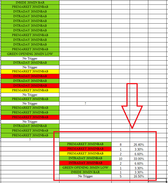
What is the difference between “PREMARKET 20MIN BAB” (red) and “PREMARKET 20MIN BAB” (yellow) and “PREMARKET 20MIN BAB” (green) other than the background color? Your intention can only be fulfilled using macros, which seems an unreasonably effort to fix poor sheet design. There must be a reason for your colorization whose rules you don’t provide with your question. And these rules for the colorization may better fit to create the table you want to achieve.
the colours represent whether they worked or not, obviously green worked, red did not and yellow worked but was not ideal due to other factors… these are set ups for an activity i undertake and i want to be able to view the overall success of different context with triggers such as Premarket 20minBAB… if i have to i will just enter new figures as i add new colour coded records
I think you can make it easier with the conditional formatting. In conditional formatting, you can assign your own colors to specific values.
I wish you success!