
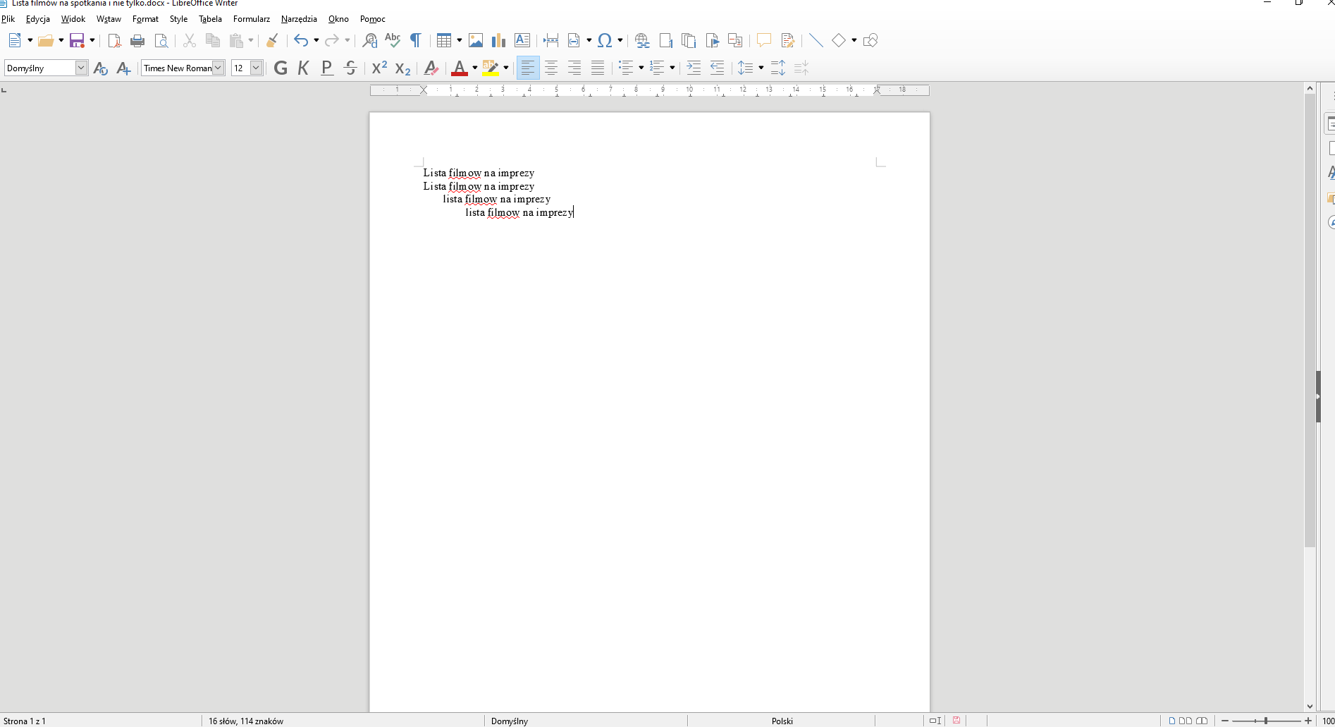
Hello. As in the picture - “filmow” is one whole word, libre is making a huge gap between “m” and “o” for some weird reason. This seems to happen only in certain places of the page which is weird - i guess a bug of sorts.
Can you provide a sample document that demonstrates this behaviour? Do you have the required font on your computer? And can you tell us the OS and LO versions you are using.
.
huge gap between "m" and "o"
I could not recognize this (LibreOffice 6.3.1.2 on LinuxMint 19.2-64 Mate). Why do you provide a Word file (DOCX), this obviously is a LibreOffice forum.
I don’t care about who likes and who dislikes word, this is still a very widely used file standard and i need to be able to edit it and work with it. Weird that this bug only occurs on windows then.
That is just the usual LibreOffice bad screen rendering at work.
It looks the worst at smaller text font sizes.
Zoom into your image and you can see part of the problem.
There is only grayscale horizontal anti-aliasing; no vertical anti-aliasing.
You only see shades of gray because there is no sub-pixel anti-aliasing.
Zoom into an image of the same text displayed in Word 2016 and
you will see multi-color sub-pixel anti-aliasing in both horizontal and vertical directions.
That makes smaller text sizes look more evenly spaced on screen (on Windows known as ClearType).
This is a known issue in LibreOffice since the “upgrades” in v5.3.
In addition there is a lack of numerical precision in the calculations done to position the characters on screen.
This is also a long-time known issue (been in the bug tracker for years).
The only work-around is to zoom-in far enough that the issue is less noticeable.
Welcome to LibreOffice.
.
Thanks, so if i understood correctly, this issue is not fixable by a regular user so far?
Correct.
Some users have actually gone back to v5.2.7.2 (last version before v5.3 rendering changes).
If you are curious use the Separate Install GUI tool to install a separate version of 5.2.7.2.
Download the tool here: Separate Install GUI – Parallel Installation GUI for Windows | Florians Mind
Open your same test doc, take a screenshot, zoom-in and compare the anti-aliasing.
What we have now in LibreOffice is similar to Word 2010 before the Windows DirectWrite updates.
Lista filmów na spotkania i nie tylko.docx
I don’t know how fonts and their installing work, could you clarify what should i do? I dont know how to check this.
Windows 10 home premium 64bit ver 1809
LO: 6.3.2.2 (x86)
Please edit your original question.