Hello, I’d like this graph to display all the years from 2000 to 2019. Would you know how to do that?
Thank you for help.

Hello, I’d like this graph to display all the years from 2000 to 2019. Would you know how to do that?
Thank you for help.
Without knowing how you have formatted the X-axis it’s hard to tell what’s wrong. Could you provide a sample file? And please provide LibreOffice version, operating system and chart type (If I make my own sample file of that it works as expected - using LO 6.3.2.2 on openSUSE 15.1)
Hint, in case you need it – The key to solving your problem is in @anon73440385 's first sentence. How have you “formatted the x-axis”?
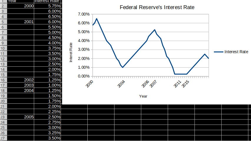
Hello, thank you for your answers. My version is 6.0.7.3. As you can see on the left side, I have put there interest rates of the Fed for each year. The prolbem is that some years the rate was changed 5 times and then many years it stayed the same. As a result, the program is confused from it. I uploaded the data sheet here: ShareGadget.com Share Send files by air mail - Share your files - Upload your file here I would like to use line graph (lines only).
Edit: I’m describing the graph in my paper and realize that the graph is imprecise since in at the end of 2001 it was 1.25% and in 2002 and 2003 almost the same, but the graph looks like it was going steadily down which is not true.
For the empty years there is no X value, hence no data pair. If you used proper dates (instead of just sparse year numbers) for each data pair you’d automatically get what you want, besides that you’d may want to specify X-Axis scale values manually and use a 365 days major interval. Even better for visualisation might be to have an X-Axis with equally distributed dates, e.g. each month’s first day’s interest rate.
Update: 2019-10-01T23:42+02:00
Based on your addition and the document uploaded to ShareGadget.com Share Send files by air mail - Share your files - Upload your file here
First, make sure your data is correct  i.e. dates in A44:A50 are not, A44 is a string and A45:A50 are in the year 1905 …
Then, with corrected data I created a XY-Chart and under Format → X-Axis, in Numbers set the number format to YYYY (unchecking source format first) and in Scale set minimum to 1999-01-01 and maximum to 2021-01-01 and major interval to 1461 (4 years). You can play with that.
Attached the resulting document: Fed.ods
Thank you very much.
Vielen Dank. Sie haben mir viel Zeit gespart. Grüsse aus Tschechien.
If the answer solved your problem please click the check mark  to mark the answer as correct. Thanks.
done. Thanks again
Thanks. You don’t need to insert a [solved] into the question, it will be marked as [closed] when closing it, like I’ll do now.
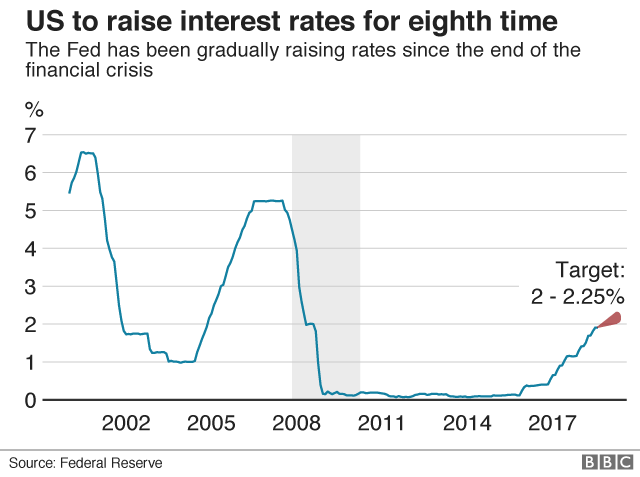
Thank you for the answer. I tried another method but did not succeed. I want that my graph looks like this: https://ichef.bbci.co.uk/news/640/cpsprodpb/E4E7/production/_103599585_fedrate2-nc.png
I uploaded here the data: ShareGadget.com Share Send files by air mail - Share your files - Upload your file here
Could anyone create the graph? or write a guide how to create it?
thank you in advance
Please do not use Answer if it isn’t an answer to the original question. For comments use add a comment, or to provide more details and/or attach documents use edit on your original question. Thanks.
How should anyone achieve this without at least a month or the correct date FED changed the interest rate - no way. If there is more than one rate on a year - data points will pile straight vertical.
@anon73440385 see the (second) document that Martinx0 uploaded, it has dates (though some wrong data).
Sorry - should no try to write any comment at midnight.