
Hi This is my first post on this forum. [wave]
I have had a good google, but my problem involves many questions and cant find answers to any of them. Likely because i am a Libre calc n00b and probably using incorrect terminology. Also I don’t understand many related answers well enough to move forward. I have pasted my version details at the end of this post.
I was going to add my file, but can’t seem to find a way to attach?
Anyway it simple so i will copy paste some raw data below.
Log Interval = 1 seconds
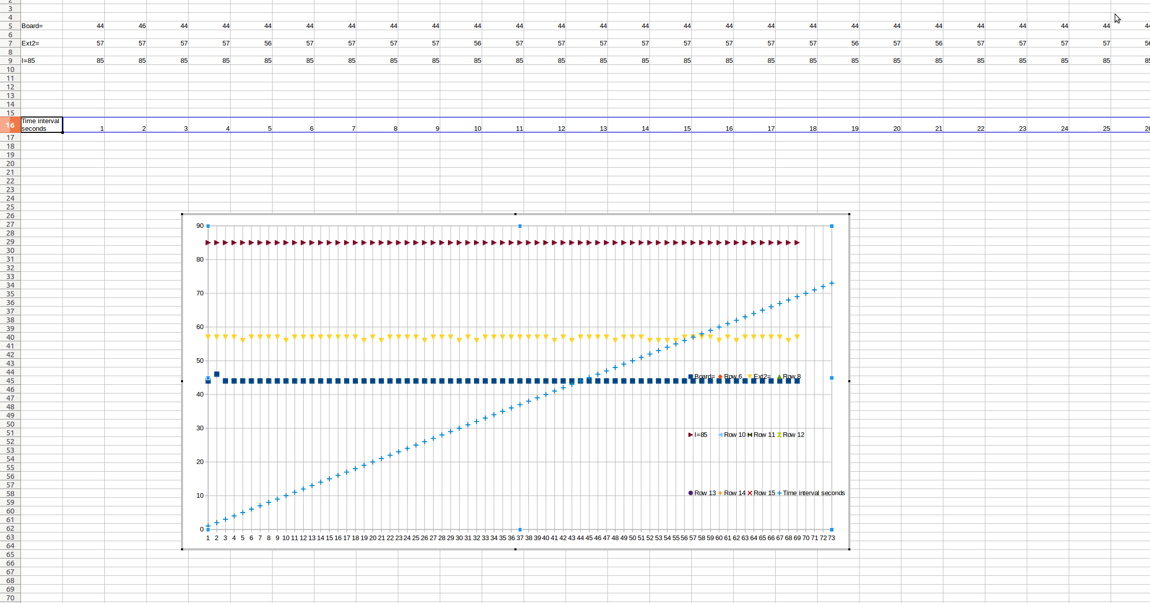
Board=44,46,44,44,44,44,44,44,44,44,44,44,44,44,44,44,44,44,44,44,44,44,44,44,44,44,44,44,44,44,44,44,44,44,44,44,44,44,44,44,44,44,44,44,44,44,44,44,44,44,44,44,44,44,44,44,44,44,44,
Ext2=57,57,57,57,56,57,57,57,57,56,57,57,57,57,57,57,57,57,56,57,56,57,57,57,57,56,57,57,57,56,57,56,57,57,57,57,57,57,57,57,56,57,56,57,57,57,57,56,57,57,57,56,56,56,56,57,57,57,57,
Ext3=0,0,0,0,0,0,0,0,0,0,0,0,0,0,0,0,0,0,0,0,0,0,0,0,0,0,0,0,0,0,0,0,0,0,0,0,0,0,0,0,0,0,0,0,0,0,0,0,0,0,0,0,0,0,0,0,0,0,0,
Ext4=0,0,0,0,0,0,0,0,0,0,0,0,0,0,0,0,0,0,0,0,0,0,0,0,0,0,0,0,0,0,0,0,0,0,0,0,0,0,0,0,0,0,0,0,0,0,0,0,0,0,0,0,0,0,0,0,0,0,0,
I=85,85,85,85,85,85,85,85,85,85,85,85,85,85,85,85,85,85,85,85,85,85,85,85,85,85,85,85,85,85,85,85,85,85,85,85,85,85,85,85,85,85,85,85,85,85,85,85,85,85,85,85,85,85,85,85,85,85,85,
The above data is a very small sample. Ultimately I will be accumulating days worth probably at 60-600 second intervals.
The log interval can be changed. So I want to make this a variable in my graph. it will always be counted in seconds. ie 1, 10, 60, 300, 600 etc etc
What I want to do is make a graph from data logger data. I can copy paste data from the logger as required (Logger has limited memory so i can’t log the length I want to, So need a more powerful program, which is why I am here).
I have figured out how to separate the data into columns.
Now I think I need to make a row with time intervals, dependent on the number in the time intervals cell? So I can use for the x axis on my line graph.
Also wondering if I should change the rows of data into columns? I already tried this in google sheets, but it ran out of columns fast… Example data log - Google Tabellen
Ideally I’d like to copy paste more data in later and have my graph grow to fit it. But for now I will be happy to just get to the point the google sheet is at.
I got sort of close, but got stuck with the time intervals, so just put 1 in a cell and dragged it out to get started. Need to change this later so I can add time intervals.
I also got stuck making my time row the x axis… Read about making it an x-y scatter chart, but that didn’t help much either. Because I don’t understand the options well I think.

Version: 5.1.6.2
Build ID: 1:5.1.6~rc2-0ubuntu1~xenial10
CPU Threads: 12; OS Version: Linux 4.15; UI Render: default;
Locale: en-US (en_AU.UTF-8); Calc: group