Justified alignment special font, not justified

I am using LibreOffice Writer 6.3.5.2.

I am writing with a special font and I would like to have the lines justified. I have noticed that if I put the text in a box then I can fix the problem. Somehow having the text in a box can make the lines of the same length (then another problem is that they don’t stop at the right place).

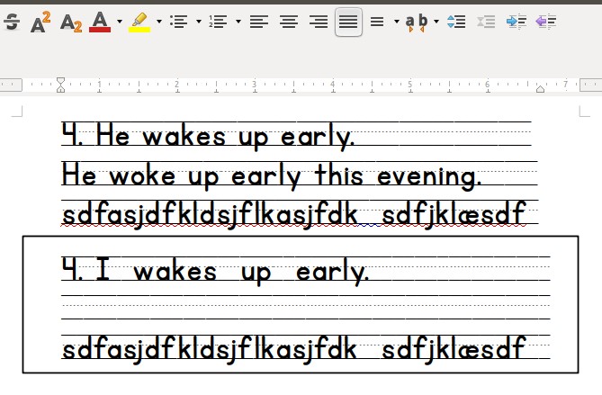
I have attached a screenshot that shows the problem and shows that the lines can be of the same length if put in a text box. But as can also be seen the textbox makes them longer.

Any suggestions on what I am doing wrong?

Justified Alignment.jpg

Here are some updates to the question.

I had replied to Mike as an answer. When I tried to change it I happened to delete it.

In the first two lines I make a line break. In the third line I keep writing. The fourth line is actually a lot of space (hitting spacebar many times), but it never continues on to the next line.

The textbox apparently doesn’t show formatting marks.

2 pic.jpg

Really hope you can help me solve the problem.

Have you tried to left-align your text instead of justifying?

(personally I would just use a table for such thing)

I have tried all kinds of alignment, only the textbox can stretch it to the same length.
I can’t see how a table would fix the problem. Please explain.
(The font includes the three lines, it is usually used in the low grades).

Please enable formatting marks (Ctrl+F10) to show actual content of your lines, then create a screenshot. That would allow to see what you have there and why “justified”. works somewhat unexpectedly - have you separate paragraphs?

I messed up my reply and accidentally deleted it. Now the reply has been added with a picture to the original question.

Fonts for schools are pretty special. A German font designer gives advice as follows:

  • There are 2 different space keys which prolong the lines; one of them is normal space (produces lines); the other one is # which produces 1/10 space.
  • The squared brackets produce the end pieces of the lines.
  • For precise end piece of a line the # space is used.
    There is no automatic justified format.

.

For another font the lines are given as drawings.

.

For more information (German) see here: https://will-software.com/infos/hlp_schul/Schulschriften.pdf page 18

The right “margin” in your samples shows unequal width in your top paragraphs. This suggests that they have not the same style, or perhaps there is some direct formatting applied to them. So, for in-depth analysis, attach your sample file to your question (edit it and use the paperclip tool). If possible, embed your special font in the document in case there is somthing weird with it.

Text box are considered drawing objects. Therefore you have not all formatting tools at your disposal inside them. They offer only limited formatting possibilities because they are first intended to be used in forms for short labels or entry fields. Don’t use them in elaborate formatting job.

The default settings for Writer in this situation is to …

  • Wrap line on the next visible character. Multiple spaces will push content forward and wrap onto the next line, but the spaces themselves will not wrap. This behavior can sometimes be confusing when combined with “justify” alignment.
  • Do not left-right justify the last line of a paragraph. Spreading a line with few words over the full text width will often make that line look strange.

I believe that the wrap behavior used to be configurable, but I can’t find how to do it now.

Last line behavior is configurable in paragraph format and paragraph style settings. See the Alignment tab.

Thanks keme. This solved the problem. Format - Paragraph - Alignment - Options (justified), Last Line (justified) - tick Expand single word - tick snap to text grid. With these settings the problem is solved.
I don’t know if I am adding to many things, but now at least the problem is solved.
If it hadn’t been for the textbox, I would have assumed that it was down to the font.
Thanks again for all the help.