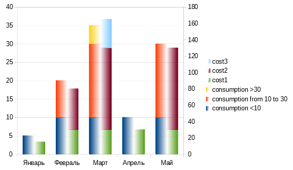
I have the following progressive electricity tariff (the more you consume - the more expensive it gets per each unit):
- first 10 kW⋅h per month - $3 per kW⋅h,
- next 20 kW⋅h during month (up to 30 total) - $5 per kW⋅h,
- everything over 30 kW⋅h per month - $7 per each kW⋅h.
(real numbers differ, this is just an example)
I’ve drawn two stacked charts:
- one for consumption, kW⋅h per each month
- other - for cost, $ per month
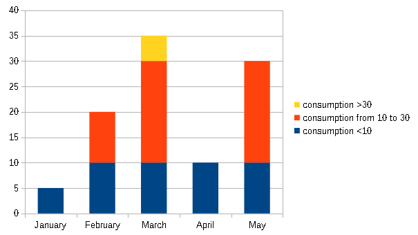
Consumption is stacked and consists of three parts:
- x <= 10,
- 10 < x <= 30,
- 30 < x.
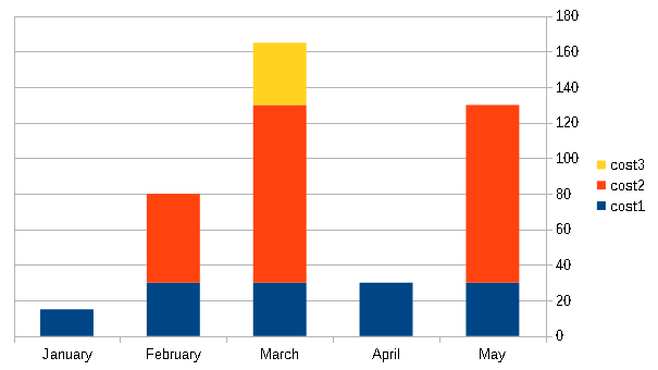
Same with cost -
- cost of first 10 units,
- cost of next 20 units,
- cost of other units over 30 kW⋅h/month (if any).
How do I combine these charts into one, with two Y axes? I want that each month has two stacked columns: one for consumption, and one for cost. Is it possible with LibreOffice Calc?
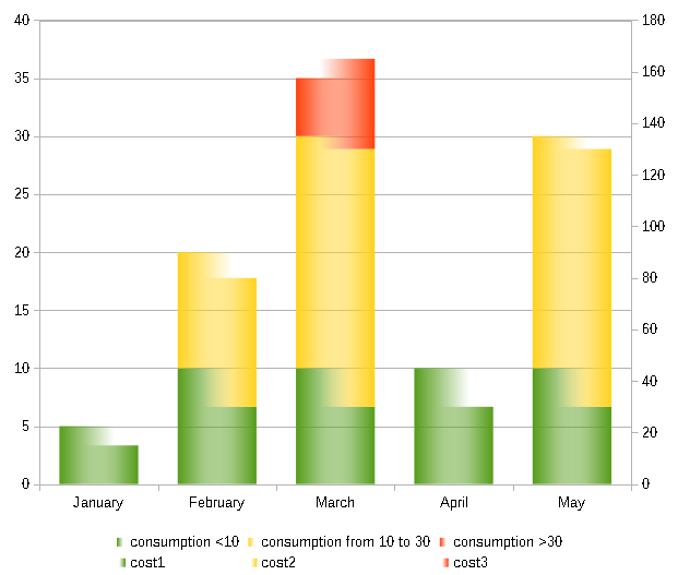
I attach sample data sheet for you to be able to easily play with it.tariff-sample.ods