Calc - How to create a percent stacked chart with percentage relative to a value

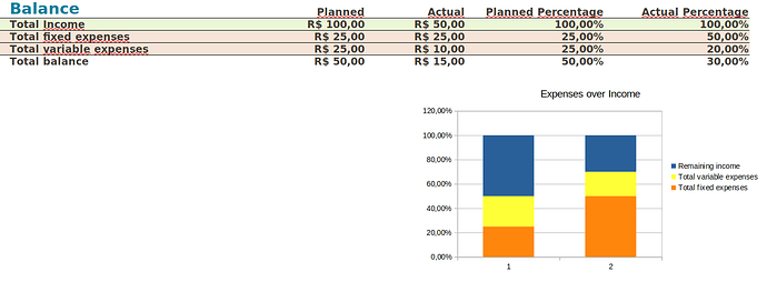
I have the following spread sheet.

The chart is showing the relative percentage of each data value with regard to the total of its category. But I want it to show the percentage over Total Income’s value. So the chart shown above would have both bars filled with 50% yellow and 50% orange, since the total income is taken in equal parts by the expenses.

I think that maybe in this desired chart things would get weird if total expenses value overcomes total income value (e.g.: total fixed expenses is a value greater than 25.00). So if it’s not possible to achieve this desired chart as a Percent Stacked chart, is there some other way to get it without percentages, but still with stacked values?

would it cover your needs just to delete the row with ‘total income’ from the data ranges, as in attached sample 250348_testsheet_test01.ods, [double-click on the chart - right click - data ranges - data series - select row - remove],

if you need different construction - e.g. percentages to another basic value - you can achieve most of it with ‘helper cells’ calculating temporary values …

Actually if I remove ‘total income’ row from the chart than I don’t have the percentage over ‘total income’. Instead, what I would get is the percentage over sum of expenses. Can you see the difference? If not, consider this example. Say the total income is 100, and expenses (fixed and variable) are equal to 20 both. Than the chart should show 20% for both expenses and 60% for the remaining income.

Thanks for suggesting these temporary values, I didn’t know it, I’ll take a look at it.

I managed to get my desired chart by adding colums to hold the percentage values. The result is shown in the following figure: