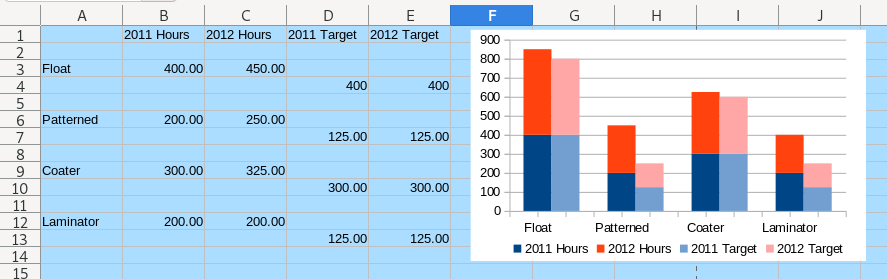
How would one do in calc a plot like this (grouped-stacked):
thank you!

How would one do in calc a plot like this (grouped-stacked):
thank you!
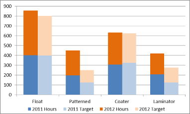
One possibility (not perfect) is to use two sets of data and two graphs superimposed. This will allow to change values once finished.
Data series spacing set to 0%.
The first/lower one with Y Axis and X Axis values font color set to white.
The last/upper one with the Chart Area color set to none; Y Axis Mayor Grid deleted.
Legends must be separated.
See sample file.
A non-dynamic graph can be done exporting two stacked bars graphs to Draw, and manually intermingle them there.
Made with LibreOffice 6.4.7.2 (x86); OS: Windows 6.1.
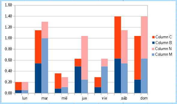
EDIT:
It could be (almost) done with one chart. I can’t replicate exactly yet (see the X-axis and the columns labels).
grouped stacked plot 2.ods (15.6 KB)
Done with LibreOffice 7.2.3.2.