How to draw graphs like this? I'm trying to use LibreOffice Draw.

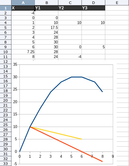
I’m trying to draw this graph. I wish it was simple. It’s not. It’s very hard.
Any tips I can use are welcomed.

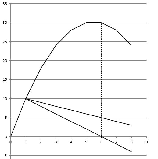
I think LibreOffice Draw should provide a built-in option for mathematical graphs like this, where we can define curve values in (x,y) format and curve bend accordingly. It would have been really helpful. Are there any other tools that provide something like this or where graphs are easier to make? Let me know.

From my perspective you are just using the wrong tool - see Calc chart type XY(Scatter)


**This is not a solution, but a prototype**

Have you tried graphs in Calc? That would be the tool to use normally, see attached sinewave ods

Draw is not intended to make graphs but drawings made of (possibly connected) shapes.

What you request can be easier to do in Calc. But the best solution is to use specialised applications. There are several in the free domain.

And once done in Calc, you can copy and paste the chart in Draw.

@anon73440385 I see. Cool. I went to Insert > Chart > XY(Scatter) and selected Points and Lines. And I see a blank chart. That’s it.

How can I change the default number of the X and Y axis, (like how you are doing)?
How can I create a curve in the middle of the blank graph, (like how you are doing)?

I went to Insert > Chart > XY(Scatter) and selected Points and Lines

Select the data range (e.g. A1:D11 in my screenshot) before you do so and select Lines only.

I strongly suggest downloading the Calc guide from the documentation page and reading the chapters relating to graphs