Add target line to calc chart

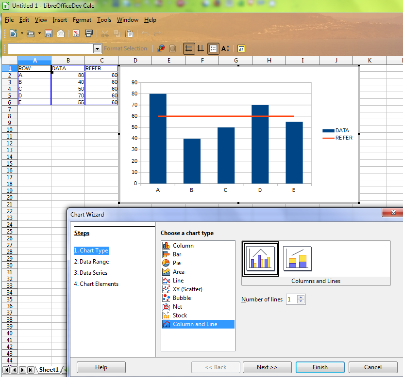
I have created this chart with Calc:
chart

In this case “60” is the “target”, so I would like to show a horizontal line going across the chart at 60, to visualize better how each bar relates to the set target.

How can I add a horizontal line?

Thanks for all help!

You can use the Column and Line type and add an extra column with all data to 60 for the line. So you can easily change the target value.

Edited 2014-06-13

Could you elaborate on that a bit? I don’t know what to do from this description.

@endolith: Right-click your chart, and select “Edit”. Now open the “Format” menu, and choose “Chart Type…” This will open the dialog displayed in this answer.