Bold Font in LO 4.1 too thick & distorted

I have just updated to LO 4.1.5.3 on Mac OSX 10.6.8

I had a drawing on file in LO Draw suing Papyrus script but bolded using LO. It now shows up too thick & indistinct.

This is also happening with other fonts eg Century Gothic in Writer aswell as Draw

How do I get it right?

I would like to send you egs but your system keeps rejecting my file upload

Update

Fonts.odt

Now you should be able to upload a file.

Could you possibly report in detail what you did when using Century Gothic in Writer? I use the same font as default and never saw a problem.

I use LibO 4.1.5 on XP/SP3.

--------------------------------------edit after comment:
I could open your file.
The word “exhibition” in the images inside you font.odt file is indeed blured out. However, you Century Gothic characters look fine. I enlarge your smaple text to font size 72 (max) and at my screen your font looks even a bit better than the attached screenshot:

Could this be a problem of your screen? Could you make a test using other applications with the same fonts and font size?
If the problem can be identified as a LibO issue, please file a bug report under:
https://www.libreoffice.org/get-help/bug/

Thanks for taking the time to drop by. I’ve now uploaded the file with 3 x egs on it - self explanatory.
The script below each is in Century Gothic & you can hopefully see the bold one is blurry.

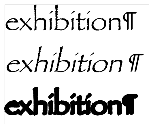
This problem appears to relate either to the MacOS build of LO or the MacOS-provided copy of Papyrus TTC (which includes Regular and Condensed) v6.1d10e1 (i.e., the MacOS 10.6.8 version, dated 2009-01-09). The Apple font is generally better than the Microsoft-provided one. However in this case using LO v4.2.0.4 I am seeing the same thing as the OP:

incorrect rendering

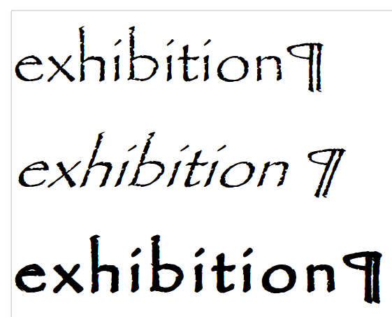
Using Papyrus TTF v1.11 (i.e., the MS Office Pro 2003 version, dated 2002-05-10) under Crunchbang 11 x86_64 with Draw / Writer v3.5.7.2 or Draw / Writer v4.2.0.4, or under Windows 7HP with LO v4.1.2.2 the result is as expected:

correct rendering

The kerning in the Microsoft copy is b0rked for bold (there are no kerning definitions in the MS font), so it may have something to do with that. As @ROSt53 suggests, please report a bug about this and report the number of any bug reported in a comment back here using the format “fdo#123456”. Thanks.