Data labels on data series

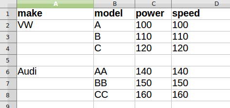
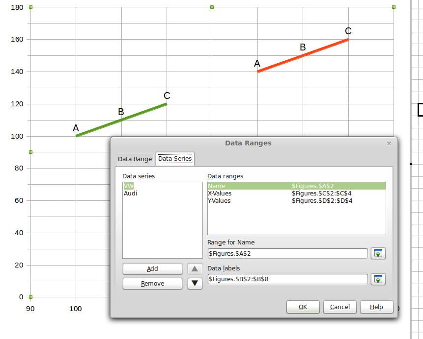
I have a simple XY Scatter (lines only) graph, all the data comes from a separate sheet. There are two data series - see the two attached pictures.

I have selected Data Labels - Show Category. It doesn’t seem to use column B properly to supply the labels. If I choose B2:B4 for VW (to get A, B, C) then try to change the Audi range to B6:B8 (to get AA, BB, CC), I find that the VW range has changed to that as well. It seems to use the same set to apply to both series. In the example here I have set it to B2:B8 hoping it will sort it out itself but as you can see it just starts at the beginning with A for each series. Perhaps I don’t understand data ranges properly.

image description

Restructure your data to columns as follows and select “First row as labels” and “First column as labels”:
Data labels, power (X), VW (Y), Audi (Y). See the attached file example.ods

That’s it and it looks so easy! I have spent hours trying to work this out. Thanks very much!
I’ve just noticed the Legend with the makers’ names. That is something else I will use.

This is a fantastic help to me. I know Estonians are good-looking, but I see they are smart and helpful too. I had made a scatter plot of 100 integrated circuit parts, showing the speed and power of each. 10 years ago in Excel 2000 I made a plot where each of the parts was a data series. Then the plot points were a different shape and color and the legend would spell out the part number. Back then I wanted to have the part number by the data point but failed. Now I see to make one series+labels.