
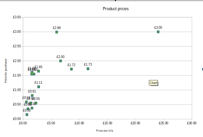
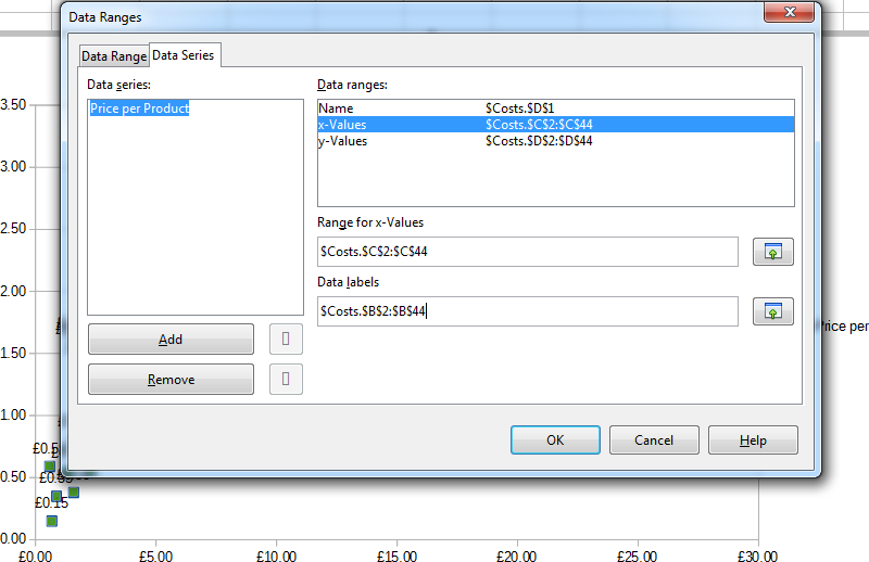
On a spreadsheet I have 3 columns of data in columns B, C and D respectively with one row above them labelling the column Product, Price per Kilo and Price per Product. I attempted to create a x-y scatter of the C and D columns to have Price per Kilo against Price per Product. This all worked fine. I then tried to label the data points with the corresponding Product name in the B column. I tried entering the corresponding range into the Data Labels column but this did not change the look of the graph. I then tried selecting the data points on the graph and chose Insert Data Labels, this inserted Labels onto each point but for the same data as the Y axis / Column D and not the Data Labels range I selected in the Data Ranges’ Data Labels. I then tried changing the Data Ranges to some dummy value and this did not propagate over to changing the value on the Data Labels shown on the graph either, it seems regardless of what I set the actual Data Ranges and Labels to that the plot on the graph insists on using Column D to produce the labels on each point. At this point I’m completely out of ideas and couldn’t find any similar problem on the web with a quick search. Any ideas?
(Edit: activated screenshots -AK)