
I looked at the word “Amsterdam” on this web page using Linux FireFox 45.7.0 ESR with at a variety of bigger and smaller zoom settings, and it does not appear to have the space after the A, like @LibreGuy’s example image is showing. So I have to agree that the way that LO is drawing fonts on the screen could be better.
Appears that adding “fuzzy” hinting helps.
I added an image below to my original answer showing the before-and-after of adding different hinting to the Liberation Sans font.
Hmmmm … when text that small is rendered onscreen in pixels the rendering engine has to make some adjustments by shifting some pixels left and right, up and down in order to draw the character.
Look at the first letter m - all three verticals are directly inline in the pixels. The rendering engine may have shifted the character to the right to make that happen. When the width of vertical lines in the characters are one pixel or less things can a bit dicey during the rendering. Compromises must be made.
Font files may also contain hinting tables which help improve the look especially at smaller type sizes.
Depends on the font.
Depends on the quality of the hinting.
The rendering engine may also have a lower limit on type size where it stops adjusting due to the limitations of pixels at 72 dpi.
On my phone right now, but will check this out tomorrow on a desktop computer.
I will test Liberation Sans and a font I know is very well hinted down to small sizes, Lato.
Have to look into the features/limitations of the new rendering engine too.
EDIT to add image after discussion in comments above.
Updating the hinting helped!
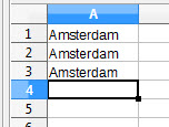
LibreOffice Calc v5.3.0.3
Line 1: Liberation Sans - 9pt - gap between A and m
Line 2: Arial - 9pt - same gap
Line 3: Liberation Sans KM - 9pt - gap gone! … and letter t looks good. (KM=me)
So the new font rendering engine takes advantage of better hinting. It appears that “fuzzy” hinting works better.
EDIT to add font file
LiberationSansKM-Regular.otf.ods
Just rename the file to: LiberationSansKM-Regular.otf
Install like any other font.
As was discussed on developers’ IRC, it’s intentional that now font layout uses kerning everywhere (unlike what happened previously, e.g., on Windows). Of course, it may require improvements with fonts hinting, as LibreTraining suggests.
Please read my second answer (which should have been a comment actually).
Thanks, but I don’t totally understand yet. Will your fix be implemented in the next version of LO? I don’t want a fix that only looks good on my screen, but not on others’. So I hope this update will be a part of the next update to come. Will this be the case?
Your improvement looks certainly better! I do notice though the letter ‘m’ has become smaller in relation to the 5.2 version, so maybe a little more tuning/hinting is necessary?
The “fuzzy” hinting is visually closer to the actual size of the characters.
Regarding any font changes getting into the LO distribution … I am just another user. So getting any improvements into LO would be a long process which I doubt would be successful anyway. And to “do-it-right” would require many more hours to fix/improve multiple font files. Given that it is doubtful that any such changes would actually get adopted, I do not see the value in investing all that time.
Totally wrong.
It’s great that “just another user” created a fix for a font that could make LO visually more attractive. And what a pity that it looks like a “long process” to get that improvement to LO! It’s not. All you need to do is to have a font’s diff and push it to gerrit. No need to e.g. build LO; everything is doable from web interface.
If you have no time to do it, you may at least post the diff here, post license statement, and I’ll do rest for you.
Well … maybe then the two of you can improve the font. Would be very nice! 
OK Mike, I will put it in the ToDo list to look at it a lot closer to see what needs to be done. As I said above I have found some other issues in the fonts while working on the font guide. Need to finish the LO Fonts guide, do the Separate Install GUI guide, and finish the base book index … then I will come back to this.
Fine! When you have time, please leave a note here, or mail me at mikekaganski@hotmail.com, or contact me at #libreoffice-dev. I would be glad to help you.
Thank you both for fixing the problem!
I don’t know how to add an attachment in the ‘comments’ editor, so I created this answer (which should have been a comment).
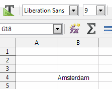
I was able to find an old screenshot of a Calc file that has the word Amsterdam in it. Also this is Liberation Sans 9 pixels (please ignore the grey background which is part of the lay out).
The font rendering was great!!!
![]()
Now what I did is I pasted this image into the previous image and I created an animated gif.
So now we can see how it was (great) and how it became in version 5.3 (not great at all).
I don’t truly understand why this hasn’t been thoroughly tested before implementing the new font rendering engine. How could this have happened? If you implement something big and new, it is supposed to improve things, and that is not what is happening here as you all can see.
The only question I have right now is … will this be improved in a future version? Can you please tell me?
(edit: activated screenshots)
- It was tested. It was tested by developers, and by those 2 1/2 users who volunteer to install and test alphas and betas. Furthermore, this wasn’t something “big and new implemented”, it was adopting code that worked on Linux for years, to also work on Win&Mac.
- To improve testing intensity, bug finding sessions were held by TDF, so that users could devote a couple of hours to test future versions and report regressions they find to improve their office suite.
- And testing was quite successful. It allowed Khaled and others to find and fix many regressions.
- Then, time-based release schedule came to new 5.3.0 release - and it came to us. But the .0 release isn’t recommended to those whose life depends on it. To the contrary - it’s promoted for early adopters, who will further test it and help improve it.
So, I find the situation OK. If you believe something needs improvement, that’s perfectly OK: please file a bug report.
@rautamiekka I don’t see the ‘attachment’ button in the comments editor.
I was not attacking you if that’s what you think. I’m just trying to give positive feedback and things to think about when implementing new features. I do like LO very much and appreciate all the hard work the developers put in to it. Not only the font rendering changed in 5.3, but also my columns in a Calc spreadsheet got wider. These are strange things which I would expect someone to notice when testing.
I said the OP, not the comments.
My mistake. I will keep in mind for next time, thanks. (I’ll leave it as it is now to prevent confusion.)