How do I change the colours of a donut chart?

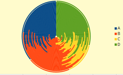
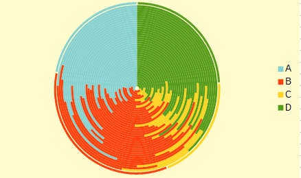
I’ve got a chart that looks like this:

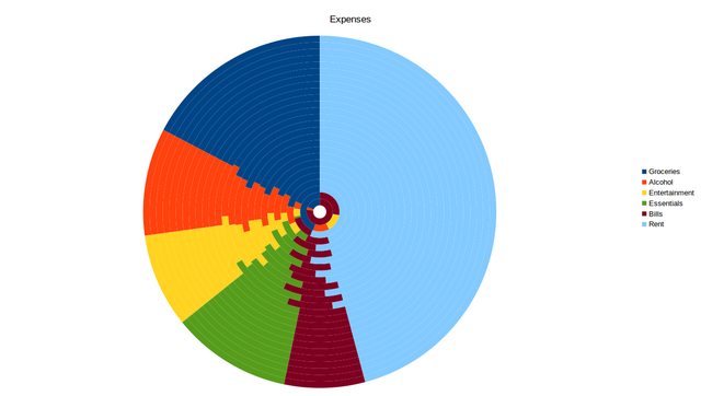
I want to change the colours, but the only way I can find to do that is one segment at a time (ie. changing each of the 156 pieces individually). Surely there’s got to be a quicker way? Some way to make “groceries” green instead of blue all at once?

Secondly, how do I change where the “alignment” falls? Like, currently groceries and rent are lined up with each other but I want Alcohol and Entertainment to line up instead.

I’ve got the data series in rows, if that changes things.

(edit: activated chart pic)

Have you tried formatting the segments? I have never worked with a donut chart so I don’t know if formatting gives you options that would help. Double-click on the chart. Right-click on any segment and choose Format. One of the options might lead you to a solution.

That lets me recolour them one segment at a time, but with 156 segments that would be a really tedious process.

OK, I am thinking you might be able to edit a characteristic of the data series in the chart, rather than formatting individual segments. I see that your “donut” chart is actually a kind of Pie chart with many concentric circles (different data series).

Maybe this will help, or point in the right direction :

Double-click on the chart first to place it in edit mode, then

Right-click inside the chart border but not on any object;

click on Data Ranges;

select the Data Series tab;

click on Fill Color;

Now in the box for “Range for Fill Color”, you need to specify the color you want for the data series selected but I don’t know how to do that.

Hi

You can directly change the color of the series by modifying: ToolsOptionsCharts▸click the concerned data serie▸click the desired color

Then you update your graph by F9

See:

before after

For the order of the series, a priori it should be enough to modify the order of the columns in the table …

HTH - Regards

Super, Pierre-Yves!! I was unable to help.

@Tiggum : If Pierre-Yves has answered your question, please click on the check-mark at the left side of his answer so that others will know.

OK, that worked for the colours, but is there no way to modify the order of the items in the chart without switching the columns around? Because the columns are in a particular order for a reason, it’s just in the chart where I want them to look different.

@Tiggum

In this case the easiest way would be to base the chart on a reordered copy of the original range. You can create the copy by formula or DDE link.

Regards