Why are stacked bar charts backwards from the data?

If I use the data

	a	b	c	d
A	2	3	3	2
B	2	2	2	3
C	3	3	3	2
D	2	2	2	3

and make a stacked bar chart, the categories are backwards (D C B A), the bar colors are correct (colored a b c d), but the legend is backwards (d c b a).

image description

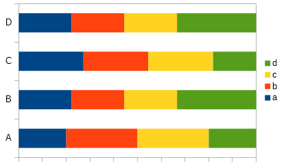
How do I rearrange these into a sane order? Is this a bug that can be fixed?

Double click on the chart to edit.

Right-click and select Data Ranges
Select Data Series tab.
With the arrows move series up/down.

Edited 21070805

TestFile

No, that just reverses the data series, so now the legend is in the correct order but the bars are backwards and the categories are still backwards.

Creating from scratch looks fine for me, See the test file in the answer.

in your test file, the categories are backwards, and the bars aren’t stacked.