Plot 2 data columns against each other - not time related

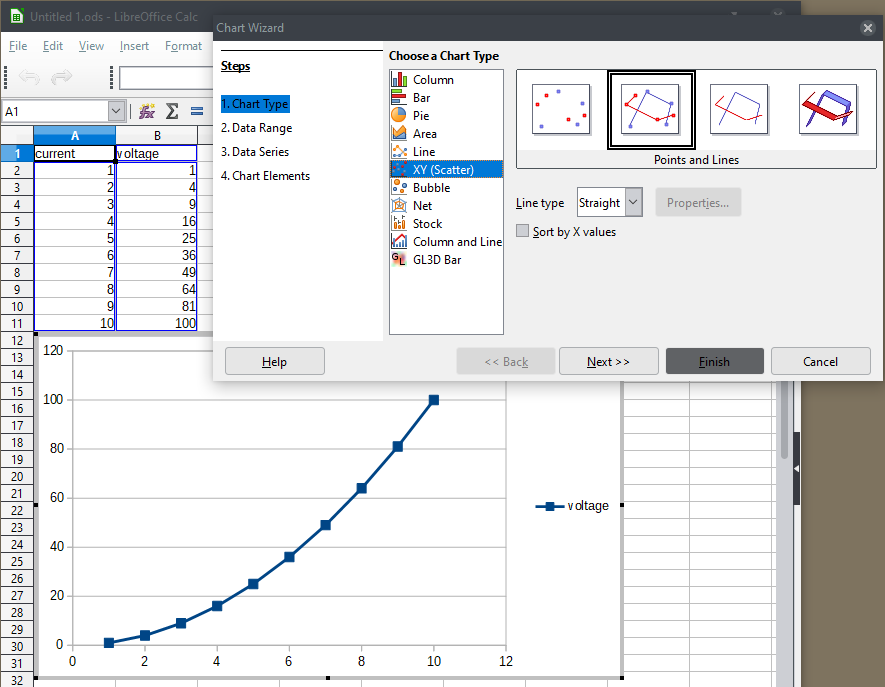
I have two data columns which I would like to compare on a chart. Say current and voltage. I do not want a stacked chart. When I use a scatter chart, I get a jumble of connected lines. What I want is a single line showing the relation between the two columns.

EDIT:

Thanks for your suggestion [editor’s note: referring to @jimk’s answer] but the current column is ordered like a time series. If the current column were not in numeric order then I don’t think it will work.

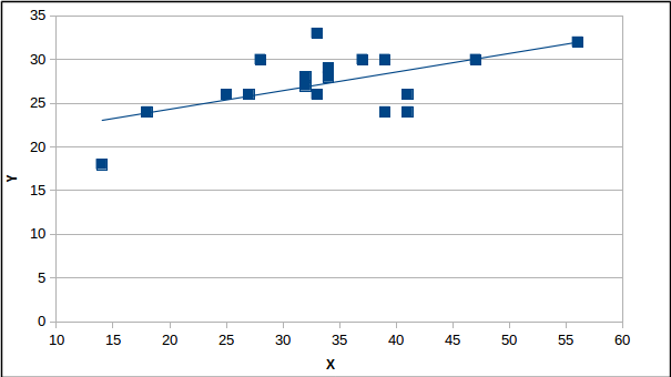
Here is a copy of some of my data.

33	26
34	29
56	32
47	30
33	33
18	24
39	30
41	24
28	30
37	30
34	28
32	28
41	26
27	26
25	26
32	27
14	18
39	24

I would copy my scatter chart but it does not seem to copy.

This might be one solution : When you choose a scatter chart, choose the one without lines (just shows the data points). Then add a “trend line” to the chart, to show the relationship between the x and y data.

Please provide some example data. If there is a simple relationship between current and voltage, such as exponential, then the solution in my answer should work.

Ther is not (not even approximately) a function-like dependence in the data. Left the values 32, 33, 34, 39 and 41 occur twice, and at least in two cases the associated right values are very different. If you want to get a “single line”, basically a trendline out of this, you need to predefine a model (space of functions) to search for the approximating one in. Linear? Logarithmic? Whatever?

I know but I see my data as linked pairs. There will be a relationship but there are other factors affecting the pairs. I am interested in trying to assess these factors so a graphical display might throw some light on the problem/challenge

So you have a real-world curve-fitting problem in three or more variables but for which you have measurements of only two (x and y). Real-world data is never tidy. If you can control at least one of the other variables, say z, perhaps the comments and answers here so far will enable you to measure and plot your x and y values for z=z1, then to measure and plot x and y again for z=z2, again for z=z3, and so on, until the relationship you are looking for becomes clear.

You say that you want “a single line showing the relation between the two columns.” I have to say that your data, taken in two columns as x and y, does not have a linear relationship, so a single line might or might not have much meaning, depending on the source of the data.

I plotted your data as a scatter diagram without interconnecting lines, just data points, and have added a “trend line” which is linear. To add a trend line, just put the chart in edit mode, then click on one data point to select all of them, then right click on the point to get a menu of options. Select “trend line” or other options.

I will try to attach the result (but bear with me as I have never done this before).

askLO-test.png

Is that what you had in mind?

Edited to display the image properly.

I would assume that the term “single line” not was used to say “single straight line”. Talking of diagrams, the term “line” is mostly used for any kind of line. The (English) dialogues concerning charts clearly use “line” in the more general sense.

I THANK you all for your suggestions. The sort by x values on a scatter chart without lines seems to produce what i want. the next step is to figure out the effects of other variables on this data. Again a big THANKS

Select only the chart and voltage columns, then use a scatter chart.

The file: scatter chart.ods

I suppose your data sequence (“like a time series”) is not ordered (monotoniically increasing) by the column to be mapped to the x-axis . To get (in the background) the datapoints into the correct order for display under the assumption of a function-like dependence of two mesurables, you need to enable “Sort by x-values” for the chart type.