
Hello there,
at first sorry for my english, as i am no native speaker 
My problem is the following:
I got a Python script which logs data from the NYTimes API.
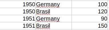
The CSV Sheet containts three different columns: Year, Country, Numbers of Articles, so the data looks like:
What i am planning now is to picture that data as a graph.
Therefore i would like to group or rather rearrange the data by using calc.
In the end i should get the different years in the first column , and the different countrys in the first row so that it looks like : 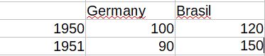
How may i do this?
Thank you very much for your support 