Character spacing reduces more than 2 pt and superscript raise by more than 62%

Hi all,

I recently joined a volunteer group recompiling many ancient Chinese documents from their original forms using either Word or any editing software, such as LibreOffice Writer.

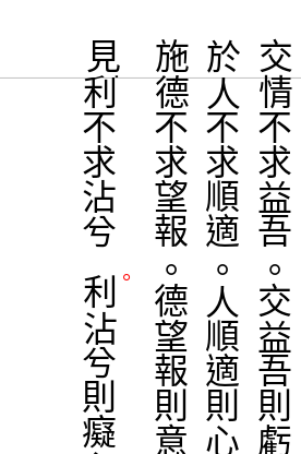
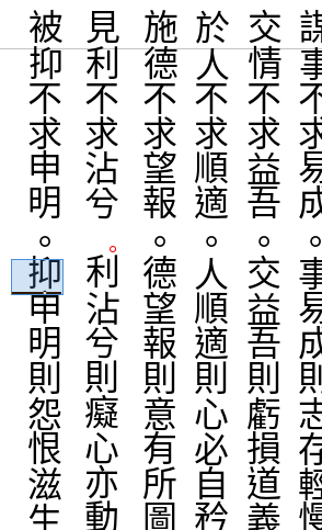
First these documents are all in vertical text orientation, secondly, the punctuation all appear to the right of the characters, however, without occupying the space of a character.

In Word, to move the punctuation to the desirable position, we can use Font → Advanced, then adjust Spacing and Position by certain points. The same document if opened in LibreOffice, the positions of punctuation are all altered. Not in their desirable location any more.

The reason seems to be the corresponding positioning operations: superscript raise/lower by certain percentage is very limited, only to 62% of the font size (my guess), and Spacing can only be reduced by 2 pt at most.

I am just curious whether or not there is a workaround in LibreOffice Writer to achieve the same effects in Word for positioning characters without such stringent limits? If so, we’ll have many more volunteers who are able to take advantage of LibreOffice Writer as the editing tool.

I have attached two screen captures at the following links to illustrate the issues I encountered:

Document in Word 2010:

The same document opened in LibreOffice Writer 6:

Thanks for your helps and comments.

IpSmiles

Superscript: I tried to raise 200% but it was reduced to 100%. Spacing: seems to be limited to 2pt when condensing, no sensible limit when expanding.

I noticed the document is .docx under LO. Does it improve if you store as .odt? .docx format is known to have compatibility issues.

Can you please provide the document itself, without any tweaking of the distances? For providing a LibreOffice document, please do not convert it from Word, but write some text from scratch. Most of the helpers here cannot create Chinese documents. But they might find the needed settings, if they had such document.

I recreated this document in Writer and saved it in odt format. Yes, in Writer one can raise a character to 100% and shrink spacing no more than 2 pt. as ajlittoz mentioned.

Here is the document link,

Thanks for helping.

It seems, that the spacing depends on the font. If you have the font installed and that font has all the needed characters it works better than with a character replacement. But I think, that you should write a bug report. In case it is not considered as bug it is at least a valid enhancement request.

This is an evidence, but it is better to state it explicitly rather than omit it. Despite the fact that LO Writer can always display Chinese, some features are enabled only if you configure them.

In Tools>Options, Language Settings>Languages, make sure Asian box in Default Languages for Documents is checked. This will reveal extra controls in dialogs.

From experimenting with Format>Character, your possible actions are:

  • horizontal placement (Position tab)

    • Superscrit puts the character to the right of the column

    • Subscript puts the character to the left, but apparently the character shifts much farther than superscript allows (this may come from the position of the glyph in its enclosing rectangle)

  • vertical placement (Position tab)

    • Relative font size seems to cause only vertical movement (at least this is what I feel, subjectively of course). The larger the percentage, the higher (translation towards the top) and bigger the character.

    • Spacing moves the character towards the top. Unless two characters are selected, negative values have no effect (since kerning normally involves two characters at least).

To complicate matters, base size defined in Font tab interacts with the settings above, allowing to put the punctuation “inside” the other characters by choosing a smaller Size and compensating with Relative font size.

Since it seems to be hard to obtain the desired formatting, I recommend defining a character style with the tuned settings and applying this style to all punctuation. The definite advantage is you can then modify the settings in a single location and it will be reflected at once on all punctuations.

Note: I don’t know if it comes from my configuration but characters seem to be off by one position, i.e. the ones at top of columns are displayed in the top margin and to select one character I can’t rely on screen display but click one position below, where character should normally be put.

UPDATE 2018-06-9

I don’t know if this is what you try to obtain; here are some examples after playing with parameters (note, I painted the punctuation red so that we see immediately where to look).

Example 1: font size 30pt (text is 24pt), superscript 80% relative size 50%, spacing 8pt

image description

Example 2: font size 15pt (text is 24pt), superscript 80% relative size 100%, spacing 8pt

This demonstrates that same font-size x relative-size does not lead to same result

image description

Example 3: font size 30pt (text is 24pt), superscript 80% relative size 40%, spacing 0pt

Now, punctuation is on the right side of the character

However, if the goal is to reduce spacing between punctuation and the character before, I have not found how to do it with a measurable effect. I tried to reduce kerning with both characters selected, but the limit at -2pt is too strong.

Thanks for your response. What you described here is exactly what I have done. However, I still can’t re-position the punctuation to the desired location. The superscript percentage max at 100% in terms of user specification. However, it moves to roughly half of that space horizontally.

To position the punctuation so it doesn’t occupy a character space in the column. I need to shrink the vertically the space above the punctuation as well as the space below the punctuation, max is 2 pt.

I’m not familiar with Chinese writing. In the tests I conducted, I noted that the Chinese font on my computer looks somewhat like a fixed width font, i.e. all glyphs, including punctuation, seem to have the same enclosing rectangle. Punctuation occupies only a small amount of this rectangle, leaving ample space all around.

A means to shrink punctuation area is to decrease font size in the Font tab, Asian font text section which will make the rectangle smaller. …

… Then you have to compensate for the reduced size of the glyph. Increase the relative size in the Position tab.

Since both settings interact with each other, proceed by trial and error until you find a satisfying trade-off.

Of course, do it only on the punctuation, ideally through a character style.

ajlittoz,

Thanks for your suggestions. What I’d like to accomplish is to reduce the space of the punctuation to its adjacent character below by 50% of the font size, and also reduce the space of the punctuation and the character above by 50% of the font size, thus, the punctuation yields the typical space it occupies and meanwhile make it a superscript so it is displayed on the side of the characters above and below.

This can be done in Word but not in Writer.

What I see as a limit is that only 2pt is allows for space reduction purposes in Writer which is far less than what I need if the font size is greater than 2pt which is almost always. Give a 4pt font, I can accomplish what I need to do here, but visually four pt font doesn’t not meet the eyes.

You are right, the Chines fonts are all fixed width and fixed height. All glyphs stay in a square whose side matches the font size which makes the logic of spacing much easier than the English fonts.

Not sure what I should do to submit the relaxation of 2pt spacing limit the (line length - 2 characters) as a feature request? The same applies to allowed 200% for a font to raise as the superscript.

Once the feature request is accepted, I’d like to get this issue closed here.

Thanks,