Hi all,
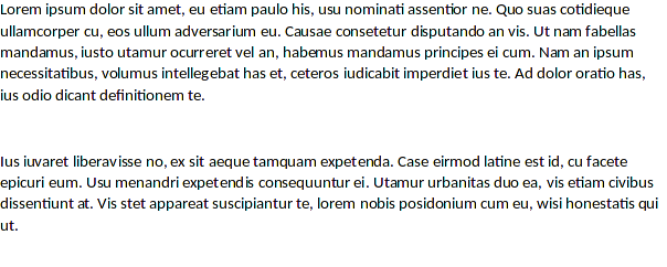
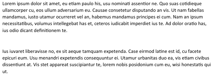
I am using LibreOffice on Arch Linux and am having trouble getting Microsoft fonts such as Calibri to render properly. By properly, I mean not looking butt ugly as they do now. I have attached a screenshot of the rendering of a Word document in Microsoft Word on Windows 10, as well as a rendering of the same document within LibreOffice on Arch Linux. As you can see the font looks anaemic and letters such as t and f look inappropriately bold compared to other letters in the text.
Word rendering:
LibreOffice rendering:

Googling around I have tried several things to alleviate this, without success, such as:
- Enabled RGB subpixel rendering (/etc/fonts/conf.d/10-sub-pixel-rgb.conf)
- Disabled embedded bitmaps (/etc/fonts/conf.d/70-no-bitmaps.conf)
- Disabled scaling of bitmap fonts (Removed /etc/fonts/conf.d/10-scale-bitmap-fonts.conf)
- Installed the freetype2-cleartype package over the plain freetype2 package.
I’m beginning to think that there is nothing wrong with my system font settings, as exporting this document to PDF, there is no problem with rendering Calibri font (it is very similar to Word).
Finally, I tried installing the Chrome OS metric-compatible fonts such as Carlito and Caladea, and then set them up in the font replacement table as shown below. This didn’t work if I only selected Screen Only, but worked if I selected Always (not sure why…)
This gave a somewhat better rendering, but the spacing of the letters still seems off to me, and there seems to be a blue halo around some letters:

I want to get such documents rendering as true as possible to how they look in Word. It seems this can be done as Okular (PDF reader) has no problem displaying the exported document with good fidelity. Has anyone been able to find a satisfactory method to do this?
Regards,
Michael
EDIT: I fixed the issue with the blue tinge, by enabling LCD filters (/etc/fonts/conf.d/11-lcdfilter-default.conf). But the letter spacing (kerning) still seems pretty off.


