
Test2.ods(/upfiles/1589298694801724.ods)Hi…I am a brand new user. I have made a very simple spread sheet (2 columns with 5 rows of data). I am attempting to make a chart with the data in column B as the Y axis. I have tried two different ways; first I tried switching the data in the columns, and second I tried the technique I found here that you change the data ranges. Neither method has worked for me; the chart always has column A as the Y axis. Or perhaps I am not changing the data properly in data ranges.
Any suggestions? Thank you…
Which chart type do you use - [Line or XY(Scatter)]? Most common new users mistake: Using Line chart (which is using categories on the x-axis) while XY(Scatter) would be appropriate (numerical data on both axis)
Thank you for responding. I am using a line chart. Per your comment, I tried using a scatter chart, and while it does put the data on the appropriate axes, the resulting chart is not useful for what I want to do (generate an equation for the resulting line that I can use to estimate values not in the data). Would it help to download the .ods file? It is only 10K.
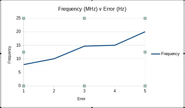
Opaque. While the scatter chart does contain the information that I want, others I wish to share it with may have difficulty interpreting it. I clipped two files, my .ods file and the resultant chart showing the style (simple line chart) that I would like as the final result. The “problem” is that the x-axis only shows the #'s of the data points 1 thru 5; instead I would like it to have the values of the error for each frequency so from left to right it should go from -.095 to +.062. I really appreciate your guidance.
Steve
See this file showing Error vs. Frequency and Frequency vs. Error:Data-Test-Modified.ods. This is what your numerical data are about (if they don’t show what you expect, then there is a problem with the data and not a problem of their presentation in a chart)
The conclusion for me: There is no (linear) relationship of Error and Frequency.
[Update] Updated the file with a Line Chart, which seem to show what I assume you had expected. But: The numbers on the x-axis must not be interpreted as numerical data. They are categories in a line chart and used as labels for the ticks (see their equidistances, while the real numerical values are not equidistant)
Hope that helps.
If the answer helped to solve your problem, please click the check mark ( ) next to the answer.
Ok…I finally solved the problem. Yes, you are absolutely correct in that the error v frequency is non-linear. Actually I am surprised by this, but that points to a problem with the electronics as the data is correct. There is another set of data which shows the frequency offset v frequency (the frequency shown on the measuring equipment v the actual frequency) and this plots as very linear. I am at a loss as to why the “error” is not linear while the offset is, but that is a question I will ask the electronic gurus! Again, thank you for you patience!
Steve