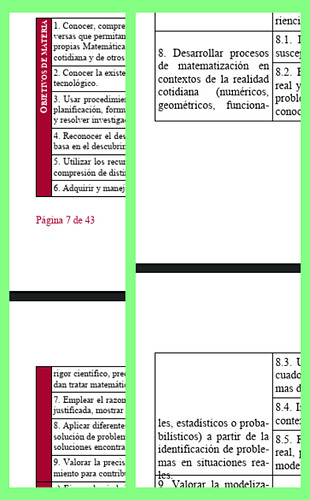
Your tables have a “complex” structure: cells in the first column are merged as their contents are common to several rows in the other columns. All cells have content vertically centered.
In Table>Properties, we see that the tables can split across several pages (necessary because the tables span several pages) and rows can also split.
This is usually fine, but here the merged cells in the first column introduce a disturbance. When a page break cause a row split, Writer gets confused about how spread first column text. It seems to compute correctly the amount of text is the split parts of the cell but is lost when it comes to position the text: top or centered in the part before the break and seemingly full centering space in the part after the break as if the cell has not been split with the result of clipping overflow text.
It is a bug. Please report it on bugs.libreoffice.org and attach this sample as an example.
Meanwhile, some workarounds may mitigate this bug (without curing it totally):
- Remove row split: this will ensure page break can occur only between original rows. Unfortunately merged cells are still split.
- Enable Repeat heading with the first x rows (x=1 for the first table, x=2 for the second). This will not eliminate the issue but makes it less probable (at least this is what I saw). It also improves legibility of your table without the need to scroll back to the beginning.
Another way to fix the problem would be to change a bit the look of the table.
Instead of merging vertically, you merge horizontally one row across the width of the table. In this wide cell, you enter your “Bloques y suspesos” or “CE” aligned on left or centered (to your taste). The “CE y CC” or “EAE” remain in their second column with the first column still merged to show the extent of the applicable rule but it is empty, thus not causing Writer confusion.
I also suggest you use built-in character style Vertical Numbering Symbols when you want text written vertically instead of your present manual formatting. It will be easier to manage centrally.
Also, use a multi-level list for numbering your items: level 1 in first column, level 2 in second column (just type a tab character at start of item to promote it at level 2; this “level tab” does not show up on print). This is more reliable and allows you to add, reorder or delete items without caring for the numbering: the are automatically renumbered.
EDIT
See in Tables.odt a proof of concept about the change in table presentation and use of list numbering. Note I did not pay attention to details of formatting (font face, size; …). I used two paragraph styles for the list because your numbering is different in the tables: in the first you only have one number in the current level, while in the second you display the full number hierarchy.
To show the community your question has been answered, click the ✓ next to the correct answer, and “upvote” by clicking on the ^ arrow of any helpful answers. These are the mechanisms for communicating the quality of the Q&A on this site. Thanks!


