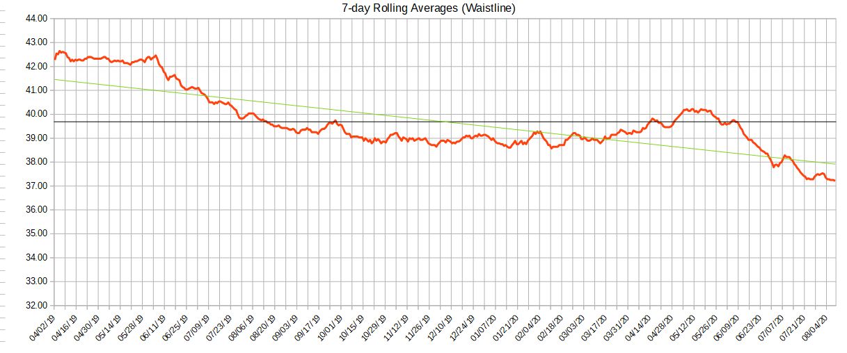
I’ve made legends before on other charts but for the life of me, I can’t figure out how to do it with the chart pictured herein. I’ve been on a diet and this chart represents my waistline over a period of about 15 months, with daily rolling averages of 7 days. That last point isn’t really pertinent except for the fact that this average is a daily data point. So, that’s over 400 cells of date data.
When I click on the legend button on the toolbar, it makes a legend of the date. So, I then have a cumbersome and unwanted legend with 400 dates in the legend box. I want the legend to have notation for the red waistline data, the green trend line, the black mean value line.
Thanks.