barometer.csv.ods (rename to .CVS)
barometer.ods
conky.zip.odt (rename to .ZIP)
I cannot seem to format the x-axis (horizontal, DateTime-based) of a chart to have the data-points placed at the actual point indicated by the date-time of collection rather than evened out throughout the day. I’m very much hoping that this is a setup/format mistake by me rather than a bug.
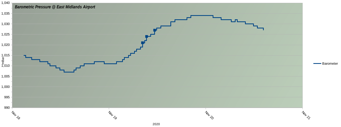
This is what the current chart looks like:-
This chart is based on 3 days of barometer readings. There are approx 18 readings per day in this set, but the precise time of collection varies for each value (it is collected when the barometer value moves up-or-down by at least 1 mBar from the previous value). In spite of that, each bar is shown evenly across the x-axis.
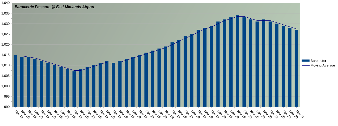
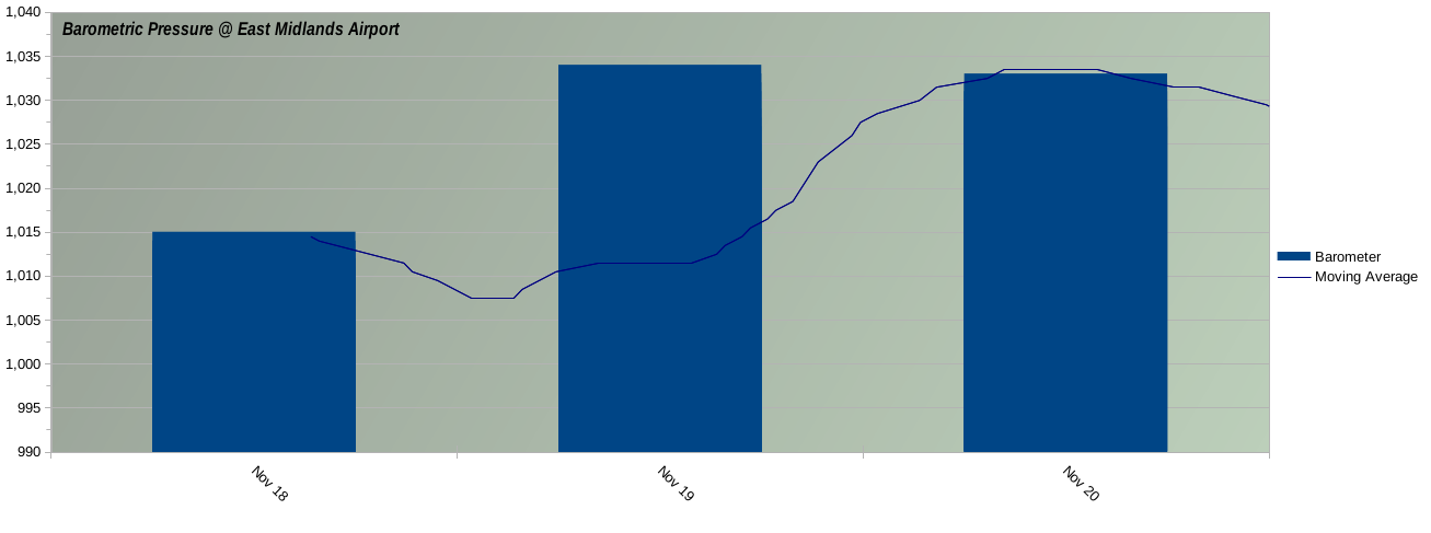
Using menu: format | Axis | X-Axis | Scale I have to choose a Type of “Text” to get the arrangement shown above. Alternative values are “Automatic” or “Date”, and either of those gives the chart as below:-
Only an XY Scatter chart seems to plot the time-values correctly, as below:-
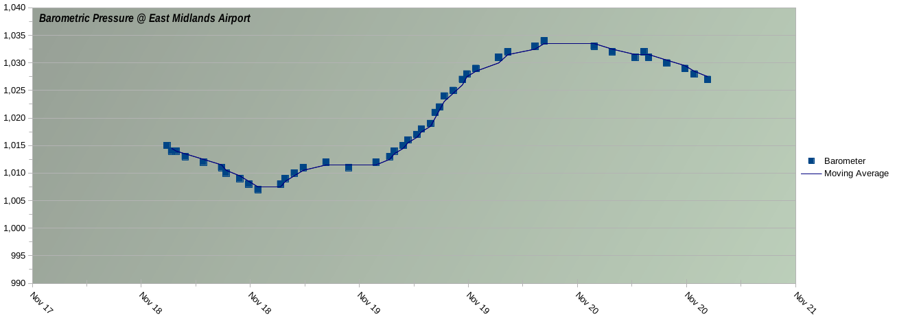
I would prefer to have a Bar chart (the 1st example above) but with the X-Values plotted at the correct, exact place rather than evened out across the axis. Is that possible?
Collected via a Conky
The barometer readings have been exported via a Conky. That was originally written by myself, and recently modified to export the Barometer values. I’ll upload those relevant files here soonish so that others can experiment with it, if they want.
Nov 23 update:
Changes tested in situ for 2 days.
Small error fixed: (“missing text block in configuration”, due to no ‘TEXT’ declaration in original conkyrc.weather before update/conversion to modern LUA config).
All files re-uploaded.
(zip-file at top)