I’ve search through the web and in LibreOffice settings, but I was not able to find a way to do it.
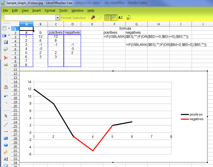
I want to know if it is possible to change the color of my chart (standard line chart) according to his value ? Example with those coordinates :
[0,12] [1,8] [2, -1] [3, -5] [4, 2] …
For the first 2 values (with y >0 ) I want the chart line to be black, then for the values 3 and 4 (with y < 0) I want the chart line to be red and then again for values 5 and 6 (with y > 0) I want the chart line to be black.
To make it short, I want the equivalent to the number check box : “Negative numbers in red”.