Hi,
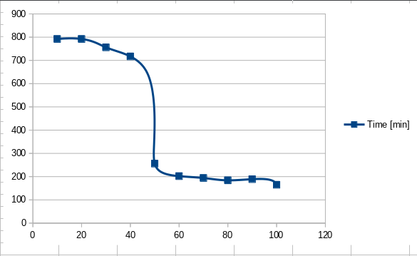
I have been doing some measurements for a RAID drive migration and have the values in minutes on a specific migration rate.
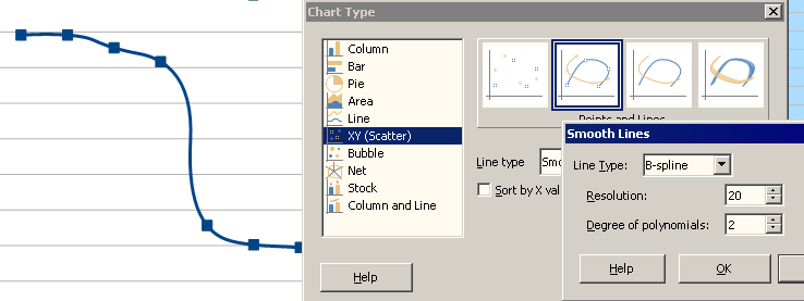
When I create a chart and use smooth line drawing then Calc adds a small aberration between the points 3 and 4 and between the points 5 and 6. See screen shots.

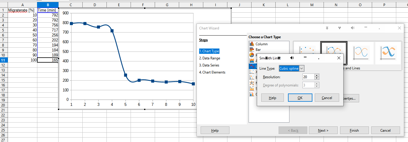
However these aberrations are not correct and should be continue more like smooth curves rather than aberrations.
How can I modify the chart graph such that I do not have to enter any new measurement points?
Attached is the source calc file.
Thanks!
–Gaismair