@mlo, The apostrophe seen in your sample image appears to be a quotation mark.
I am not an specialist in Italian (nor in English), but I found that the symbol used to indicate an elision is not uniform (may be a result of the help of the many autocorrect tools in every word procesor, internet browser, etc., or the wrong keyboard layout selected.
In LibreOffice, as default, when you type apostrophe (Unicode U+0027 ')¹ it is replaced by an English left or right single quotation mark (Unicode U+2018 ‘ and U+2019 ’),² one or the other is chosen depending on whether or not there is a character to the left.
You can change this behavior at menu Tools - AutoCorrect - AutoCorrect Options… - Localized Options tab, unchecking the Replace option below Single Quotes.
To revert the autocorrection for a single instance, press Ctrl+Z (Edit - Undo) after typing the apostrophe.
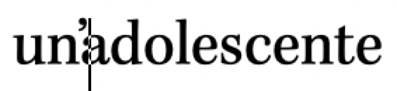
But not all designers think that things should be as we expect. So, if we choose the wrong font we can’t blame the designer.
As @gabix wrote:
It is clearly a feature of this font family.
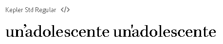
Source: https://fonts.adobe.com/fonts/kepler#fonts-section
What about Libre Bodoni font?
See LibreOffice Help on Entering Unicode Characters.
¹ https://www.unicode.org/charts/PDF/U0000.pdf
² https://www.unicode.org/charts/PDF/U2000.pdf
Tested with LibreOffice 6.4.7.2 (x86); OS: Windows 6.1.
Add Answer is reserved for solutions. If you think the answer is not satisfactory, add a comment below, or click edit (below your question) to add more information. Thanks.
Check the mark ( →
→  ) to the left of the answer that solves your question.
If the answer helped you, you can mark the up arrow ( ) that is on the left (to vote, you need to have karma of at least 5).