
Hi there,
I’m aware of the procedure for two colour representations when using stacked, 3D bar charts.
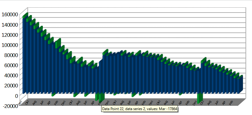
As can be seen from the attached image, the two colours can definitely represent the “base” value and the “change” compared with the previous value.
The data can even be structured to correctly position the variation above or below the “base” value depending upon whether the change is positive or negative.
I would love to be able to represent a diminution in value with a red stack but even formatting the underlying data for red negatives doesn’t change the colour rendition.
The basic chart structure only permits the definition of two fixed colours.
Is anybody aware of a manner in which the second colour may be varied according to whether it is positive or negative?
Thanks in anticipation.
MultiColour.png
Hello,
the only way I can imagine is to use two helpers columns splitting positive and negative values into separate data series - see the following sample file
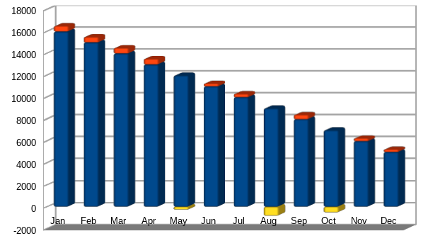
Remark You may need to adapt the legend.
Unless you used Photoshop that looks like the solution to me. I will need to adjust my own data sources to facilitate the change but I don’t see any real problems there. Thanks for your inspiration.
Unless you used Photoshop…
My sample file proves the contrary 
Confirmed, no Photoshop, worked like a charm. I definitely learned something new today - Dankeschön.