Pivot Table/Chart: How to enforce linear X axis pace across skipped rows?

I am creating a pivot chart (simple column style) from a pivot table that is based on a daily log table with one entry per row. Each entry in the log has a date, some numerical values, and a severity level. The pivot table layout uses the dates as a row field, the numerical values as data fields, and the severity level as a page field.

If the page field is set to a specific severity value, say “warning”, only matching rows are included in the pivot table. That’s to be expected and all well. However, the resulting pivot chart is visually hard to make sense of, because at the X axis, days without a “warning” event are completely skipped.

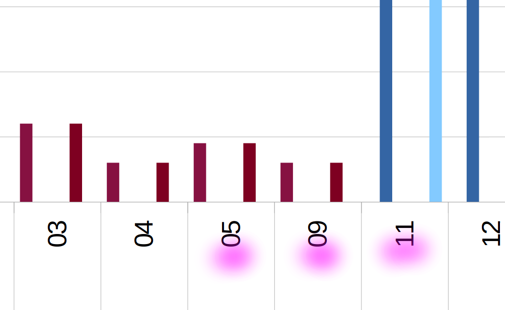
See this screenshot where days 6, 7, 8 and 10 have no place:

I have fiddled with the “ignore empty rows” option in the pivot table layout, but it was already unchecked and doesn’t seem to have any effect on this.

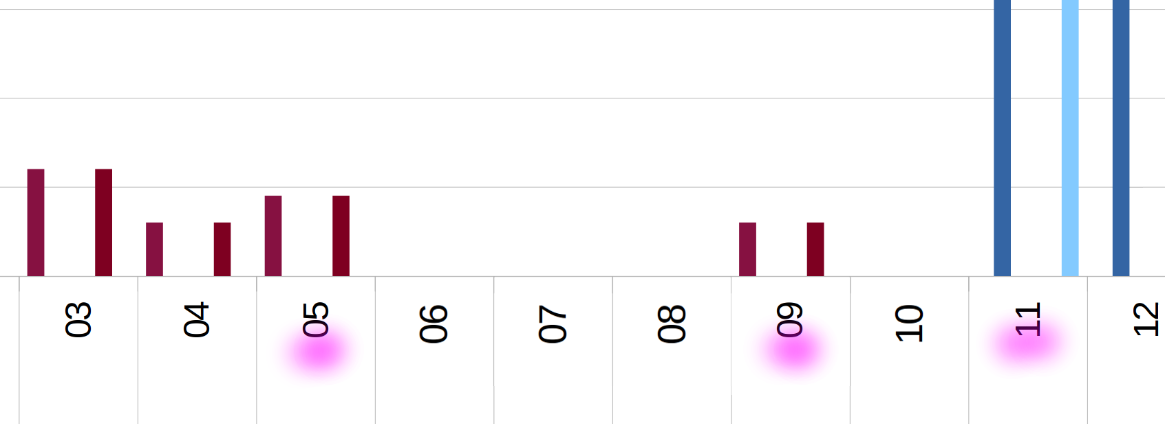
For a more intuitive chart view, I actually want the X axis to keep linear pace across days that have no matching entry, like in this (gimped-up) picture:


**Is this feasible - and if so, how?**

Edit: LO_pivot-chart-jumps_sample-file_20210218.ods

Please attach a sample file, so someone can take a look to see if can help to you.

Include 0 value, for empty cells. So there will be no empty rows.

Thanks for your suggestion. Unfortunately, zeroes don’t help in this case, as the gap days already contain non-zero values that are just omitted due to filtered severity levels.

I’m getting back to this again thanks to posts by @anon73440385 pointing out that “XY scatter charts” do preserve linear proportions in both dimensions. Yay! With a data range based on a plain table, they would constitute a perfect solution to the problem raised in my OP.

If the XY chart is based on a pivot table though, the X axis counts up from 1, as if the “day” column was missing from their data range, see the third sheet in the attached file, please:
LO_pivot-table-charts-lacking-data-range-settings_sample-file_20211225.ods (34.8 KB). - Would you guys consider that a bug or a feature?

Normally, I would fix the misrepresentation in the “data range” settings of the chart, but alas, those are missing from the context menu, and the chart setup dialog mysteriously skips the “data range” and “data series” steps!

Do you know any technique regardless, to show proper dates at the X axis?

Edit: I have found a workaround, see https://ask.libreoffice.org/t/simple-workaround-to-bypass-flaws-of-xy-pivot-charts/.