Will this cut-off letters bug ever be solved?

I have submitted this as a bug a while ago but was told I just need to change preferences to “do not cut off F”, which frankly sounds strange - why not make “don’t cut off ‘F’” a default setting?
Needless to say, even that option does not fix the issue, especially if a LO document already has cut-off letters. BTW, “f” is not the only letter that can suffer from it, but most of them do the same, like “o” and so on, depending on their shape.
Anyhow, the biggest and easiest to reproduce bug is to type a letter before a space, AFTER the space was already typed, like when you edit a text. The problem is most obvious with italics, but I’ve come across it with normal letters too, randomly.

In the image, the text is:

af r

The problem looks the same in print and on the screen:


Notice the cut-off “a” in the bold type? Strange and also a perfect illustration of how unpredictable and frequent this problem is.
The original bug report:
bug 135053

Can’t reproduce it in 7.0.4.2. Please post link to the bug report.

Can’t reproduce it in 6.4.7.2 (x86). Can you give more details about font name, size, or (better) share a sample file?

Click edit below your question and use the paper clip to upload a sample file; don’t use Add Answer, that is reserved for solutions.

Seems to be tdf#135053

Attached file in bug report uses Garamond Premr Pro which is not present on my computer, thus does not display as @ptbarnum intends. Also comments are not really useful because we don’t know for sure what to look for (the arrow attached to the beginning of a word not to a specific character). Comment talks about “F” while text contains both “F” and “f”. Which should be considered?

IMHO, if clipping occurs both on screen and on print, Writer may not be the culprit. There may be something wrong with the font. Where was it downloaded from? Has it been tampered with? Is it damaged?

I can reproduce it, but only if I also have a Highlight colour set at the same time. You can reproduce it with most fonts this way; the paragraph below the Garamond is Liberation Serif and is slightly clipped. Given the clipping that is happening to the “a” as well I am pretty sure Highlight has been set to white in OP’s sample screenshot.

The fix is simple; use a paragraph background colour instead of Highlight as in screenshot below where the paragraph is highlighted in white. Or better still, just not have a background colour. Cheers, Al

[Edit 2021-03-09 23:40 UTC]

In the tdf#135053 page there is an odt, Cutoff_F_.odt which has direct formatted white highlighting applied to all the words. If I select the text and it italic to see it, then some cutoff is visible, if I then press Ctrl+M the white highlighting disappears. The text appears to have some styles applied to it, even character styles, so why have direct formatting?

To remove the white highlighting, click Edit > Find and Replace (Ctrl+H). In the dialog click in the Find field, then click the Format button, select the Highlighting tab, click on colour and select White, OK. Click in Replace field, click the Format button and click the None button in Highlighting, OK. Click Replace All. End of problem.

Very bright analysis! This means there is a conflict between the rectangle used to hold the highlight and the bounding box of the glyph. What would be interesting to know is how the slanted version of a font is taken into account. AFAIK, glyph boxes are always rectangles not parallelograms, unless the variant is synthesized perhps, and some kerning is added to better layout characters. Therefore there should be no clipping.

A possible explanation is the glyph has strokes which overflow the bounding box. This trick is used mostly by cursive fonts to attach visually adjacent characters.

But, even with cursive fonts, it is very difficult to reproduce the clipping though there are hooks outside the bounding box. It happened only when I applied a variation (italic) for which there is no font file. The font renderer had then to extrapolate one from the “regular” one. Don’t rely on Writer to tell you the variant exists: it always shows regular, italic, bold and bold italic in its list.

OP should now tell if he has the italic variant of Garamond Premr Pro. If no, this is no bug (in primary analysis, considering how highlighting colour is applied). Fix is easy: buy the italic variant.

Thank you @ajlittoz , you have raised some interesting points.

First one though is the some clipping occurs in Liberation Serif of which I definitely have an italic version.

The second is whether it is the font or the rendering. There is obviously a different implementation between Character Highlighting and Paragraph Background.

OP had document in Word (Normal style is included) and had no problems then I presume. I have an old copy of Word (2010) which cannot open .odt without damaging them so I saved the file as docx. In Word with white background there is no clipping so I suspect the rendering of Highlighting in Writer could be improved. Cheers, Al

I guess it is related to tdf#95157

Well, now, I too am stumped. The original with the posted screenshot came from a manuscript, but was copied/pasted into a new, fresh file with no styles and then sent to the laser printer. Then I tried recreating it in another new file and it did it every time as in the posted scan so I figured it was easily reproducible… and I didn’t save the file.

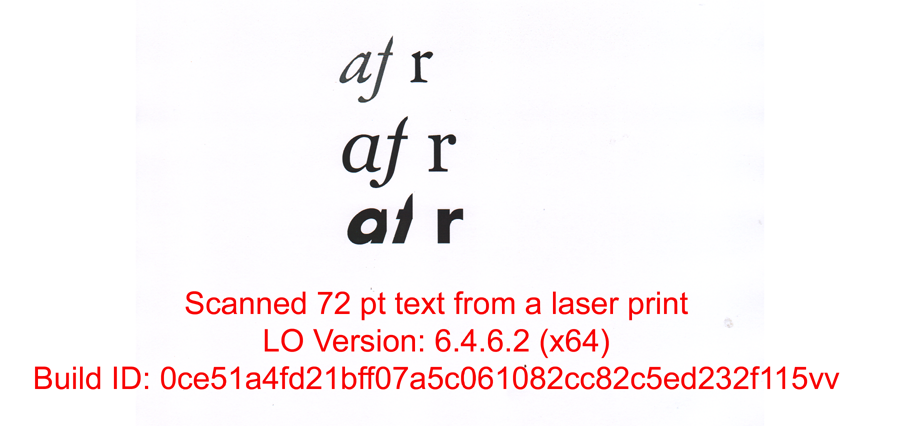
I still have the original manuscript but now, the problem shows only when there is no space between “f” and “r” (F is italic, R is not). The highlight color is set to “no fill”. In the paragraph styles there is no highlight color either but F is cut off.

In the text I posted as the original bug last year, there is no visible highlight color, meaning, the background is white, however, the highlighted color says it is yellow! If it is yellow, why am I seeing white? You can probably open the file I submitted for the bug and see for yourself.

Note: fonts used are Adobe Garamond, Aharoni and Garamond Premiere Pro (last one downloaded from Adobe directly).

Someone mentioned that this could be due to lack of original italic font - not the case here.
The only explanation I have, besides the obvious that bounding box or highlighting is improperly applied even if it shows no fill, is general instability of software.

HOWEVER, this I only noticed after the manuscript was opened in M$ Word, edited and then re-opened in LO. A few times, the file would get entirely ruined after export-import to and from M$ Word, and I had to resort to editing the xml file in notepad++ and copying/pasting missing bits from healthy files.

Seems to me that either LO writer is unpredictably unstable or that large files tend to get corrupted, or that some user prefs files (does LO have some place it saves preferences) get corrupted after a while.

i have noticed many strange behaviors too: importing styles from a file doesn’'t work sometimes. Changing headers and footers is outright impossible in one of my manuscripts, but setting them up the first time works fine. And so on. Don’t know what to make of it, but i have a feeling M$ doesn’t play nice… and may have ruined some preference file(s). Is there a place where all preferences for LO writer are saved? Can those be reset or erased to start fresh?

IMPORTANT EDIT:

JUST FOR THE KICKS I STARTED M$ WORD WHILE LO WAS RUNNING AND THE PROBLEM IS NOW EASILY REPRODUCIBLE! I GET F CUT OFF AND ANY OTHER LETTER IF IT IS ENTERED AFTER THE SPACE THAT FOLLOWS.

WHAT DO YOU MAKE OF THAT? Does M$ word change something about how OS handles bounding box? Why doesn’t it affect M$ itself (no problems there, I checked)?

PS. It is very late here, but I will try to screen grab a video of all this and will post it somewhere for everyone’s amusement.

(edited by ajlittoz to make it nice)

The white highlight is inherited from Word. It is useful to set document background color to something different from white.

Whenever you make round trips between .odt and .doc(x), expect damage to the document structure because the formats are not based on the same primitives. Due to the poverty of styles in M$ Word, elaborate formatting in Writer has to be downgraded to be able to be translated in the only direct formatting that Word understands. The more round trips, the more degradation.

LO is quite stable. When documents are fully styled (no direct formatting) the layout is predictable and reliable.

You mention Garamond Premiere Pro but the file attached to the bug report advertises Garamond Prmr Pro. Is this the same font face where the name has been shortened for convenience? Is this abbreviation the official technical name?

PS: your addition is not a solution to your question and should have been set as an edit to the question.

The information about “round trips” and damage that follows is too important to not be included in the manual. I did more tests and all the numerous problems I have experienced in LO writer are in some way connected to M$ Word use and/or going back and forth.
My impression, after using LO for almost two years, is that there are weaknesses in the code and how highlighting and background color is handled, as well as many other important “features” which are hidden from an average user, making the writer appear worse than it is.
As it is, LO gives an impression of an elitist program not meant for new users. Too bad, because it is a great idea, mostly well executed but which fails in some most basic aspects. Writers of the manual should prioritize information given AND write in-depth, detailed, technical explanations of essential tools such as templates and styles. There is plenty of information on how to open and close a file, but explanation of templates, the essence of writer, is poor…

If LO has features that competition can only dream of, it is time that all its weaknesses are quickly resolved, starting with the user manual.
The very first sentence in the user manual should be:

*"Warnings:

  1. While LO supports docx format, the two are inherently so different that using non-native format will result in corrupt and/or permanently damaged file! In other words, only use if you can live with losing your work.
  2. LO keeps preferences, such as styles etc, in … If inconsistencies appear in the way those work, user should reset all preferences by doing…
    TIP: save your preferences so you can revert to them when they get corrupted."*

Sometimes a little planning is all it takes. I have zero experience with writing word processing software, but 30+ yrs with programming, writing lessons and documentation (for much more complex software and CS) and have written complex algorithms myself. LO is easy, but made to be hard to use and learn.

It took me years to discover and fully appreciate the advances brought by styles and later by templates.

Like all document processing app, Writer must be accessible by new users to give them the incentive to use it better and by “experts” who are closer to desktop publishing (DTP). This wide range is the difficulty.

But, IMHO, the real challenge is to convince people to drop the M$ Office approach which is wrong and had polluted the debate for years (I dare not write “decades”). The philosophy about ubiquitous styles is Writer is good for structuring document design but it is not pushed far enough. There are still areas outside styles (e.g. sections and tables, the latter despite the so called “table styles” which aren’t) which hamper really smart use.

Elitist? I don’t think so. Complex? Sure. Needs a lot of time to understand and master. High entrance cost? Not really, the dreaded direct formatting allows to transition smoothly.

The first and really bothering pitfall is people rarely read the manual when switching. They think they know what a document processor is because they used Word to write one-page one-shot letters. They must forget it and their bad habits. They should accept with humility to start everything anew.

Styling is frequently seen as a sledgehammer to punch a fly. When you start writing document with 5+ pages, you soon realise that styles are your friends, not only paragraph styles but all others too. And when you are in an office environment with 5-10 different documents to write every day (notes, letters, contracts, memos, technical documentation, …), you come “naturally” to templates.

But all this needs to admit that spending some time on the manual is not lost time.

Writer is not attempting to be a Word clone; it is a fully fledged word processor in it own right. If you use Word for your work documents then always use Word for them. If you use Writer, then always use Writer for the same files.

I suggest reviewing Differences between Writer and MS Word files