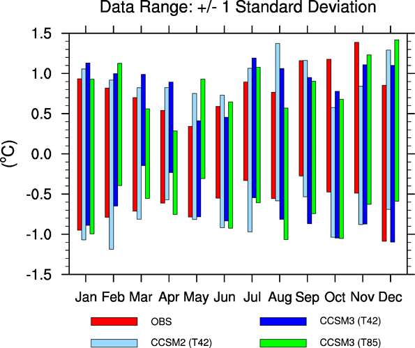
How do you make a floating column chart, where one range of data is the bottom of the column, and another range of data is the top of the column? You can fake it by creating a stacked column chart and then making the bottom range invisible, but this doesn’t work if some of the bottoms are below zero and others are above zero:
I am not completely clear on what is required as the description (stacked columns) does not appear to match the displayed example (columns arranged beside each other). Can you edit it to make this clearer? I have edited the question to make consistent use of “column” and “range” rather than “bar” as a bar chart is a separate type of chart in Calc and the question appears to relate to the column chart type. Thanks.
It is possible, but it requires more work. I don’t think I can do better than this tutorial: http://peltiertech.com/Excel/Charts/StackedColumnsAboveAndBelow.html
Even though it is using Excel, it just uses basic formulae so should be transferable.
Thanks for the link. Unfortunately it does not appear that the charting facility in Calc can float stacked columns of data as easily as Excel can. It is possible for stacked columns to cross the X-axis, and there are workarounds for limited floating, but the data needs to be arranged differently for Calc.
Actually, Excel does not have any greater capacity in this regard than LibreOffice Calc. Did you try the example from the page I linked to? Even the formulae work in LO as advertised. It is exactly the same method that John uses in the other answer, although his formulae are more elegant (use of MIN rather than nested IFs).
@mikebibo, I did try the example, with the exact same formula, but the results I get in the chart are quite different from that displayed in even the first chart. Example ODS here.
@ oweng, Check your formulae in your attached spreadsheet: Rows 10 & 11 are correct, but rows 12-14 are not, with incorrect cell references, and in rows 15-19 you have transcribed “<” as “>” 
@mikebibo, good grief! Thanks for clearing that up. Awful error. My apologies. Works exactly as you suggest.
@ owing No worries. We’ve all done it.
Hi. In the attached file i have created a basic floating chart.
With all specialist charts such as this one the key is the organisation and manipulation of your data. If the minimum value is less than zero then display the min value. If it is greater than zero then you need a spacer to position it in the right location. To position the maximum in the right location just display the maximum if the min is below zero otherwise you need to calculate the difference between the min and the max.
To create this chart I used three calculated data series. 1. The first series is the spacer for the min value. This needs to be be zero if the low is below zero or the same value as the low. The formula is =MIN(0;LowCell). 2. The second to display the low value. This is the low value if below 0 or it must be zero as the spacer has positioned the bottom of the column for low values above 0. The formula is =MIN(0;LowCell). 3. The third series displays the top of the bar. The High value. This is the High value when the low value iss below zero and the difference between the high and low value when the low is above zero. The formula is = HighCell-MAX(0,LowCell).
Once the series are set up, inset a stacked column chart. Then the rest is formatting. 1. Remove borders for all series. 2. Set the first series Area Fill to None. 3. Give the second and third series the same Area Fill colour. 4. Change the location of the horizontal axis labels. Select Outside Start for Place Labels in the PositionIng tab of the format axis dialog.
Hope this helps.
Chers,
John

