When it comes to percentage values the main question is what is 100%.
I assume that the sum of two values for each variable is 100%. The the chart should look like:
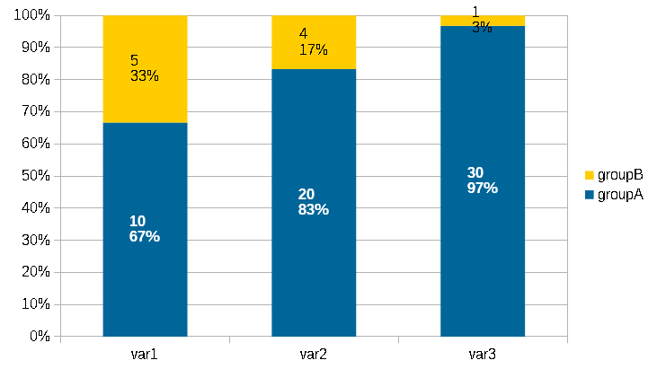
In each column each data point contains 2 figures: Top is absolute value and bottom is the percentage value.
If this is the chart you need, I recommend to do the following:
Double click you chart until you see 6 black little squares in a greyu frame.
Right click somewhere in the chart > chart type > select top right
Click once into a data point an all data points of the same group show green squares
Right click into the data point > Format data labels > tab: data labels > check show values and percentage > adjust the format > OK
a bit lower: Seperator > select what you want, I selected new line > OK
If my assumption with the 100% value is wrong, please explain the situation.
I recommend to have a look at the free guides which you can download from http://www.libreoffice.org/get-help/documentation/
EDIT:
Let me start from the end - the 100% question. Possibilities are
- in each var the sum of group1 + group2 is 100% (this is what I used in my example)
- in each group the sum of var1+var2+var3 = 100% (then my assumption is wrong but then your example is also wrong)
- the value for combination of var and group is a percentage figure which does not add up with one or more of the given figures to be 100% (then all must be considered differently)
Each group can be differentiated by color. You can actually give each data point a different color. Once in the editing mode of the chart (6 little black squares around in a grey frame) you need to double click in a data point and you can modify the color of each single datapoint analog to the color setting for a series for data points
Two colums per group is not possible. Per group you have 3 var. Or you want to have 2 columns per var, one column for ich group. But with 2 colums per var beside each other you might need to recalculate your percentage values
I recommend strongly that you clearly define what is 100%. Otherwise i have to make to many assumptions.
