
I have L/O 4.4.
Could you show a sample dat?
I’m doing this for many years.
You need a 4th column for the date/time you took the measurements. Your columns should look like this:
Date/Time(X-Value), Sys, Dia, Pulse
Then create a Line-Chart with your data. I set the Sys and Dia Series as 1.Y-Axis and Pulse as 2.Y-Axis.
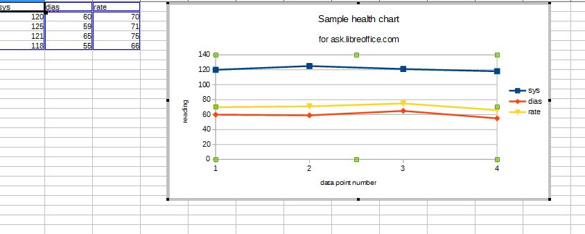
What @horst suggests will work. However, it is not necessary. Selecting the three columns of numbers and then “Chart” will generate a chart plotted against the row number, or data point number. See the image below. The chart shown is a Line chart, a Bar or Column chart is also an option. This was done in LO 4.3.2.2 (Portable) on Win 7.
If you do opt to put a column in as per horst, then it could be a date as he suggests, but could be just about anything else - time of day, initials of who took the measurement, an ordinal number (which will give the results I show), what you had for breakfast, etc.