Fine! When you have time, please leave a note here, or mail me at mikekaganski@hotmail.com, or contact me at #libreoffice-dev. I would be glad to help you.
Thank you both for fixing the problem!
I don’t know how to add an attachment in the ‘comments’ editor, so I created this answer (which should have been a comment).
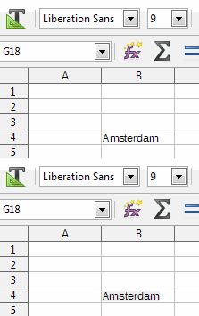
I was able to find an old screenshot of a Calc file that has the word Amsterdam in it. Also this is Liberation Sans 9 pixels (please ignore the grey background which is part of the lay out).
The font rendering was great!!!
![]()
Now what I did is I pasted this image into the previous image and I created an animated gif.
So now we can see how it was (great) and how it became in version 5.3 (not great at all).

I don’t truly understand why this hasn’t been thoroughly tested before implementing the new font rendering engine. How could this have happened? If you implement something big and new, it is supposed to improve things, and that is not what is happening here as you all can see.
The only question I have right now is … will this be improved in a future version? Can you please tell me?
(edit: activated screenshots)
- It was tested. It was tested by developers, and by those 2 1/2 users who volunteer to install and test alphas and betas. Furthermore, this wasn’t something “big and new implemented”, it was adopting code that worked on Linux for years, to also work on Win&Mac.
- To improve testing intensity, bug finding sessions were held by TDF, so that users could devote a couple of hours to test future versions and report regressions they find to improve their office suite.
- And testing was quite successful. It allowed Khaled and others to find and fix many regressions.
- Then, time-based release schedule came to new 5.3.0 release - and it came to us. But the .0 release isn’t recommended to those whose life depends on it. To the contrary - it’s promoted for early adopters, who will further test it and help improve it.
So, I find the situation OK. If you believe something needs improvement, that’s perfectly OK: please file a bug report.
@rautamiekka I don’t see the ‘attachment’ button in the comments editor.
I was not attacking you if that’s what you think. I’m just trying to give positive feedback and things to think about when implementing new features. I do like LO very much and appreciate all the hard work the developers put in to it. Not only the font rendering changed in 5.3, but also my columns in a Calc spreadsheet got wider. These are strange things which I would expect someone to notice when testing.
I said the OP, not the comments.
My mistake. I will keep in mind for next time, thanks. (I’ll leave it as it is now to prevent confusion.)
