Limits on number of fields or area of layout?

Are there published or “rule of thumb” guidelines about the limits on either the number of fields or the area of the form layout in Base? I am creating converting paper data collection forms into Base for ease of analysis later.

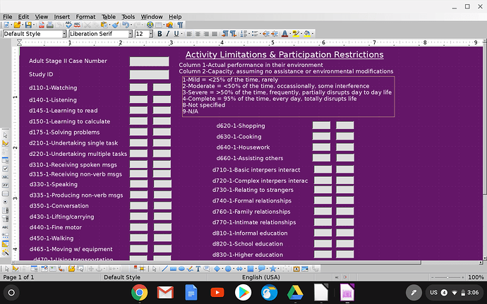
There are hundreds of fields total in the paper version of this form. I’ve already divided it 5 separate forms in Base based on category, but I am still having some problems with the largest one, which has 80ish fields in one form. The two problems are: 1) Tabbing through the form after about half way and all of a sudden the labels go blank; 2) when any scrolling, either right or down, is necessary, it seems like the scroll window will randomly reset to the top-left position, especially if I deviate from the tab order; and 3) the activation order seems to mix itself up at the end after I set it correctly.

This is similar to a general question I asked a weekish ago, but now with specifics after I enacted some of @Ratslinger 's recommendations. Aside from creating numerous different forms for the sole purpose of keeping the number of fields down in a single form, what are my options here? And generally, why does Base seem to have trouble holding still relatively modest amounts of data on a single form? I feel like I must be missing something here.

Fields continue down below bottom of screen, additional 8 rows or so in each column

Here you can read the base documentatin.

Thank you sir. I’ve read the documentation previously, and just re-read the forms section again for another hour at your prompting in case the answer to my questions was clearly written within and I had missed it. Unfortunately–whether because of my reading comprehension or the manual not covering this material–I was unable to find any information to help with the questions I am struggling with.

EDIT: Playing with the zoom… I find that if I zoom out to 65% so everything is visible without requiring scrolling, then I can tab through everything without problems. Is this a common experience? Or unique to my machine? I am running LibreOffice through ChromeOS’s Crostini, which I realize has several graphics problems in it’s current iteration. But I know LibreOffice is not immune to bugs either… Hard to know which is at fault

@plw Please see my answer concerning the tabbing. It is not unique to your system. It is a LO bug. Also see answer to other info on splitting up data into other tables.

Hello,

There is a know bug (tdf#93287) which deals with fields tabbed to outside of the normal view. I believe this may also affect the tab sequence.

As was mentioned in a comment (as overly busy or data doesn’t belong) on the previous question you referenced (Button to open new form - macro?) it appears you have data on the form which would be better off as a sub form and a separate table or even two. It would appear those individual items can be in their own table and related back to the main table. You could possibly have another table with all the codes & descriptions and then use that in a list box.

Split the data into multiple tables and use a sub form. All can be done within one simple little form.

Edit 2019-04-23:

Can only go by what has been presented thus far. Attached is a simple example of just one of many possible approaches to making your form much more simplified.

Example ------ SurveyExample.odb

The sub form uses a table control for capturing the various elements. The ActivityID is a list box to select which item is entered. Again, this is just one of many imagined variations. It certainly appears your screens are overly crowded and complicated with information which may be handled in other manners.

Edit 2019-04-24:

Sample ------ SurveyExampleHSQLDB.odb

Thanks for the notice about the bug.

I’m having trouble understanding what the benefit would be of using a subform in the case of this table, and how it would even be arranged. As I understand things, I am dealing with many 1:1 relationships, used primarily for inputting rather than displaying data. The form referenced above is only 1 of 5 sections (each with its own table) of a single data collection instrument, and I have maybe 5 or 6 other instruments like it which may or may not apply to a certain Study_ID based on age and results of the preliminary screening tools. One Study_ID, not more than one entry in each other form, and some forms with no entries for every Study_ID. When I’m done putting everything together I expect to have maybe 30 different tables total to hold all this data. Again, I’m a novice still, and if I am going about this all wrong please inform me.

@plw Please see edit in answer.

@plw, since it looks like a bug and the suggested way (by @Ratslinger) is a workaround and not an answer for the limiting numbers of fileds or say controls on an form, we could only assist in enhance the database which also results in the workaround for the display problems when tabbing through the form.

The benefit is a more flexible application and the process Ratslinger did is called “normalization”. There are not only 1:1 relationships. E.g. the activity description is a 1:n relationship (1 description - n data sets it is used in). Therefore he split the descriptions into a separate table. With this design you could easily add other descriptions without editing the form again. Also this way prevents from typing errors or lets you rename the activities or allows you to analyse your data in a more flexible way or enables you to create reports in a way this should be done. And last not least you wouldn’t need a seperate form for each study. @Ratslinger my correct me, if I’m wrong.

Part of the problem with starting out is not knowing all the possibilities. This takes time and most people want results today. So the result is what is seen here - something which may be done over a number of times.

For more information on normalization, there any many descriptions with a search. Here are a couple:

What is Normalization?

Database normalization

Best if all the information was properly analyzed to determine what is needed. This is not just for the entry but also what happens next.

Thank you again for your generous assistance. Lest I stop feeling like an helpless idiot for a moment, I can’t even open the file you sent (“no SDBC driver was found for the URL sbdc:embedded:firebird”), @Ratslinger. Searching a bit, I find (according to previous posts of yours to other novices) that this is often a Java issue. Not sure what to do in this case. Current version of Java (1.8.0_212) is enabled in LO (5.2.7.2). Running through Debian Linux 9 x86-64. Updated Java and LO and restarted just in case but no change.
I’m excited to look into all the great info you all refer to–as soon as I can open the file!

@plw The problem you are having is because the LO version you are using is fairly old. The sample in the answer is a Firebird 3.0 embedded database. The LO version you are using deals with, to my recollection, Firebird 2.5 embedded. Will place a HSQLDB sample in the answer. Consider upgrading LO. Current version in in 6.2.x series.

Excellent. Upgraded to 6.1.5.2, which it tells me is up to date…? Anyways, your file opens now, thank you. It does give me better ideas of how to set everything up efficiently, but the dropdown menu to select every single item is not just an annoyance but a liability. I need everything pre-loaded with required entries for almost all fields. I see how this set-up really reduces the visual complexity, but it seems much more time-consuming to enter a lot of data (dropdown for every item required), and most importantly, too prone to omission errors. Is there another option? I can’t figure out how to accomplish this without putting every single item into the table. This still would be a viable option, if only there was a way to flip the x and y fields and allow me to scroll down. But thus far it seems like all fields stretch out along the x axis which doesn’t seem worth considering…
EDIT: What about actually entering into a calc file and using a query insert? Maybe too messy?

@plw

Again, you do not have enough knowledge of Base and all the capabilities. For example, with the list box there is no real need to use the drop down to find the entry. Using the example you can key the first few letters and the selection will appear. This can also be changed to use your numbering method.

Don’t understand what is meant by flipping x and y fields.

There are still MANY other methods you could incorporate. One possible method (which I incorporate in a personal application of mine) is to use a macro. Note - this requires a great deal more knowledge to institute. You can actually create ALL records ready for input of just the values. Much of this you need to examine since you are the one with all the information. This site is not meant to teach all design aspects.

The key to any set up is the planning. Once you determine what you want to do and how you want this done, you must then LEARN the ins and outs of Base to accomplish this. Again, not an overnight task

Yes, despite my spending probably 70+ hours so far trying to learn Base, I am keenly aware that I am still lacking in every domain.
I know precisely what I am trying to find out with the data to be collected–we call these “outcome measures”. What I struggle with is finding information that is sufficiently comprehensive but understandable enough to help me learn what I need to know. One thing that manuals and tutorials cannot do well is helping the user consider the merits of various approaches to their unique situation and make an informed decision about how to proceed.
I have no formal computer training. I live with my family in a mud house in a developing country, and simply am trying to figure out how to keep track of an analyze data on disability in the area. Do I have the tools and capacity to accomplish this well…???
I would gladly consider hiring someone to build it for me if it’s as simple as it seems. email: 2thess317@gmail.com.

@plw I am sad to hear of your situation.

For someone learning Base, databases and all associated with it 70+ hours is not a lot of time. There is a lot to comprehend. Many times functionality comes from creative use of controls and SQL in Base. Much of this comes from experience and searching for answers others have come up with.

One of the concerns is have given you answers already, how to reduce fields on the screen and better use of list box, all I am seeing is negative comments - time consuming, error prone and more. From your screen in the question you are going to experience many problems there. You complain about not finding information but where are your specific questions? Have answered what you asked already and more. Have even asked for further information but got nothing (Don’t understand what is meant by flipping x and y fields).

Now this question has been answered. Your specific questions are most welcome. Please ask as new ones and not general such as ‘How to design’.