Hi all,
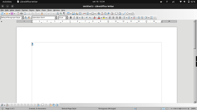
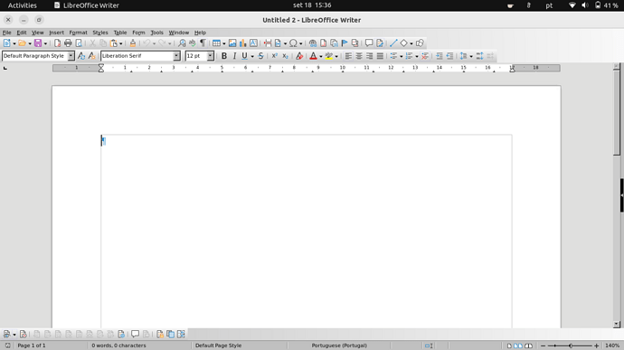
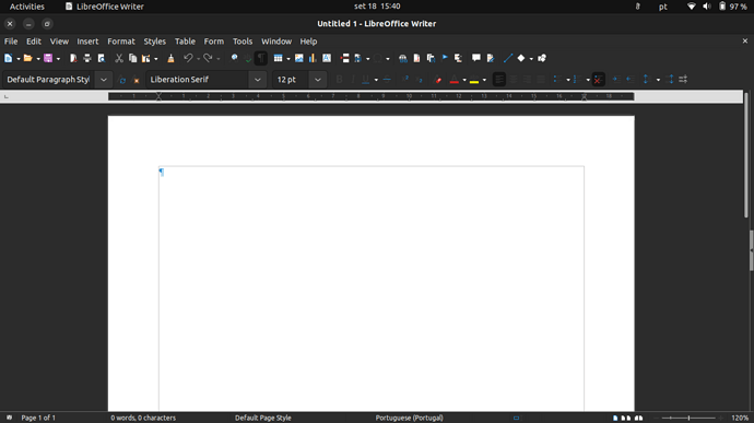
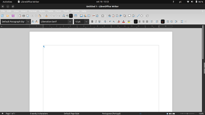
In ubuntu 22.04.1 (vanilla/gnome) Libreoffice’s top menus are very difficult to read when using dark mode because they also become dark. If I change to a lighter LO theme (Tools>Options>Personalization) when using Gnome’s dark mode LO’s menu buttons become unreadable (white letters over a light background). I searched online and it appears to be an issue with gnome 42.
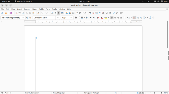
No matter what LO themes I try the issue persists. Menus can be perfectly read when using Gnome’s light mode.
This happens in a new installation of ubuntu 22.04.1.
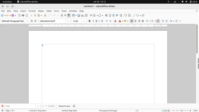
However, on another laptop, I upgraded from ubuntu gnome 20.04.5 to 22.04.1 and LO kept the default theme that came with ubuntu 20.04, which is perfectly functional in Gnome’s dark mode. I assume that this is something leftover from 20.04 that didn’t upgrade correctly (from Ubuntu’s point of view) but it keeps me productive when using LO.
I played around with the settings in LO Tools>Options, and compared both installations, but could find no way to make LO’s menus readable/easy to read in the new installation Ubuntu 22.04.1 when using Gnome’s dark mode. Using the same settings in “View”, “Personalization”, and “Application Colors”, the two installations present me with different menu colors in the two machines (dark and difficult to read menus in the new installation, whereas they remain the default grey that came in ubuntu 20.04 in the upgraded computer).
So, my question is how can I find what is causing LO’s theme to be held back to its ubuntu 20.04 default so that I can try to replicate it in the machine that has a new installation of ubuntu 22.04.1? I don’t even know if this is possible, but any help would be appreciated.
If the answer is just “it’s a Gnome 42 thing”, ok, I can change to light mode when using LO, but it’s not ideal.
I can post screenshots or provide more info if it helps.
If mods think that I should be asking this in an ubuntu forum instead, I’ll understand.
Thanks for your time.

